

It’s one thing to bring traffic to your blog. It’s another to turn that traffic into actual sales. This shift from reader to buyer is a common hurdle for many businesses, but the good news is that it can be effectively overcome. For 2025, merely attracting visitors is no longer enough; your blog's strategic design, layout, and overall visual structure are now key for increasing conversion rates.
A smart layout thoughtfully guides your audience, giving them a reason to stay engaged, explore your offerings, and ultimately, confidently proceed to a purchase. Let us show you the main lessons we’ve learned to make sure your blog never feels like a forced sales pitch, but rather an integrated part of your brand's valuable online journey.
Layout Is Half the Battle
In order to craft a blog that brings in sales, you need to have a strong foundation. Your layout shapes how readers move through your content, how they feel about your brand, and whether they stick around long enough to engage with your products.
Think of your blog's layout like a well-designed roadmap or a GPS, which smoothly guides visitors through your content, clearly showing them where to go next and preventing them from getting lost or frustrated. Here are some strategies to help guide users, maintain trust, and create space for your store to sell naturally:
- Easy Scanning: Use short paragraphs, headings, and lists to make content digestible at a glance. According to HubSpot, about 43% of people only skim blog posts.
- Support with Visuals: Add relevant images and banners next to key points, aiming to include approximately one image for every 350 words.
- Subtle CTAs: Use sticky sidebars or floating buttons that stay present but don’t disrupt the flow of your post.
- Build Trust Visually: Insert testimonials or review stars near product mentions or CTAs to increase credibility. Adding social proof under a CTA has shown a 68% increase in conversions.
- Mobile-Ready Formatting: Statista has stated that more than 60% of web traffic comes from mobile devices, so make sure that your layout performs well on small screens - clean spacing, tap-friendly CTAs, and scalable visuals are essential.
- Interactive Features: When it adds value, include collapsible FAQs or swipeable product galleries to keep your users engaged, but be careful not to overwhelm the page.
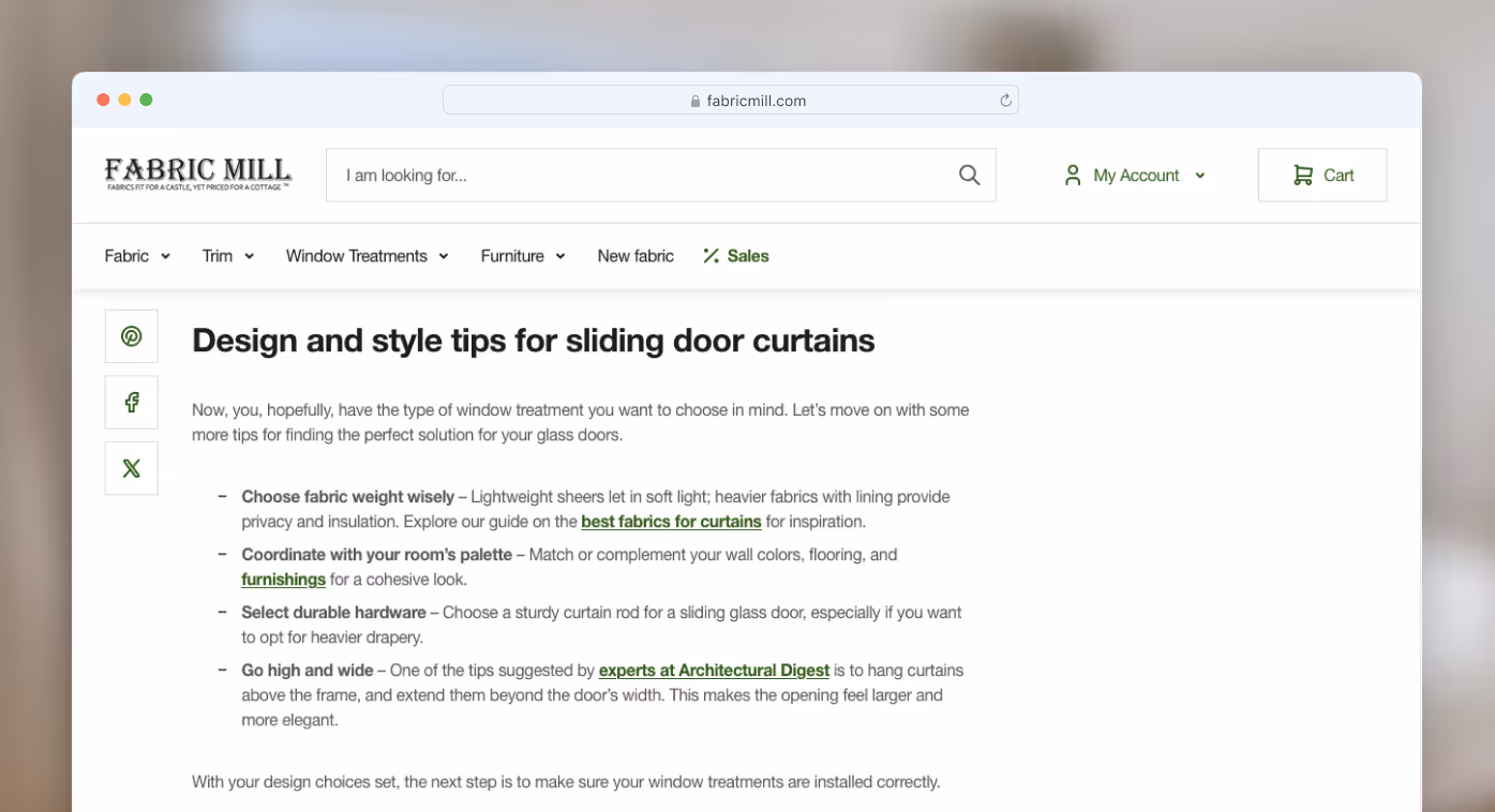
Take a look at this blog by The Fabric Mill, for example. The content is easy to scan thanks to well-organized headings, bulleted lists, and images. Both links to external and internal sources have been added to build authority and lead users towards a potential purchase.
Strategic Internal Linking
Internal links are not just about boosting SEO. While the layout of the page guides your users through the content, internal links shape how readers move through your website as such. A good linking strategy makes the content feel natural and informative, not overloaded or salesy. Keep your links effective and reader-friendly with these guidelines:
- Relevant Anchor Text: Use phrasing that clearly signals what the link offers, aligned with what the reader expects. Your anchor text should sound natural and seamlessly fit into the text.
- Functional & Fresh: Make sure every link works and directs to a live, updated page - broken links kill credibility and can frustrate users.
- Clear Styling: Users won’t click on a link that they cannot see. Use bold text, different colors, or underlined links so they’re easy to spot without interrupting the flow of your blog.
- Link Quantity: While there’s no strict “magic number” for how many links to include, many expert articles suggest aiming for up to 10 internal links per 2000 words.
- Context First: Avoid dropping links right into the opening paragraph. Establishing a connection with your audience first ensures links feel more natural and helpful, rather than forced.
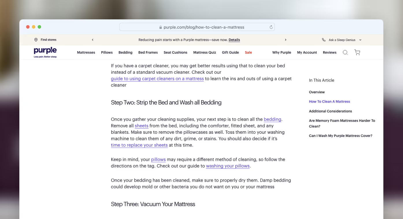
Let’s think about what’s done well and what could be improved in this guide on how to clean a mattress. While the internal links are evenly distributed, lead to pages that function, and the anchor text is a cohesive part of the content, it’s possible you might have even missed the links in the first place because of the styling. This goes to show how important it is to differentiate the design of the anchor text from the rest of the content.
Help First, Sell Second
We've all been there: searching for useful information online, only to land on a "spam page" overloaded with flashing ads and aggressive sales pitches. Chances are, you clicked away faster than it could load, and we can safely assume that's not the experience you want for your potential customers. This highlights a critical principle: prioritize providing value before asking for a sale.
When someone lands on your blog, they’re looking for help, not a sales pitch. Your primary goal is to guide them by offering clear, valuable context and visuals that solve their problem. If your content genuinely helps, it builds credibility and opens the door to a product mention that feels natural.
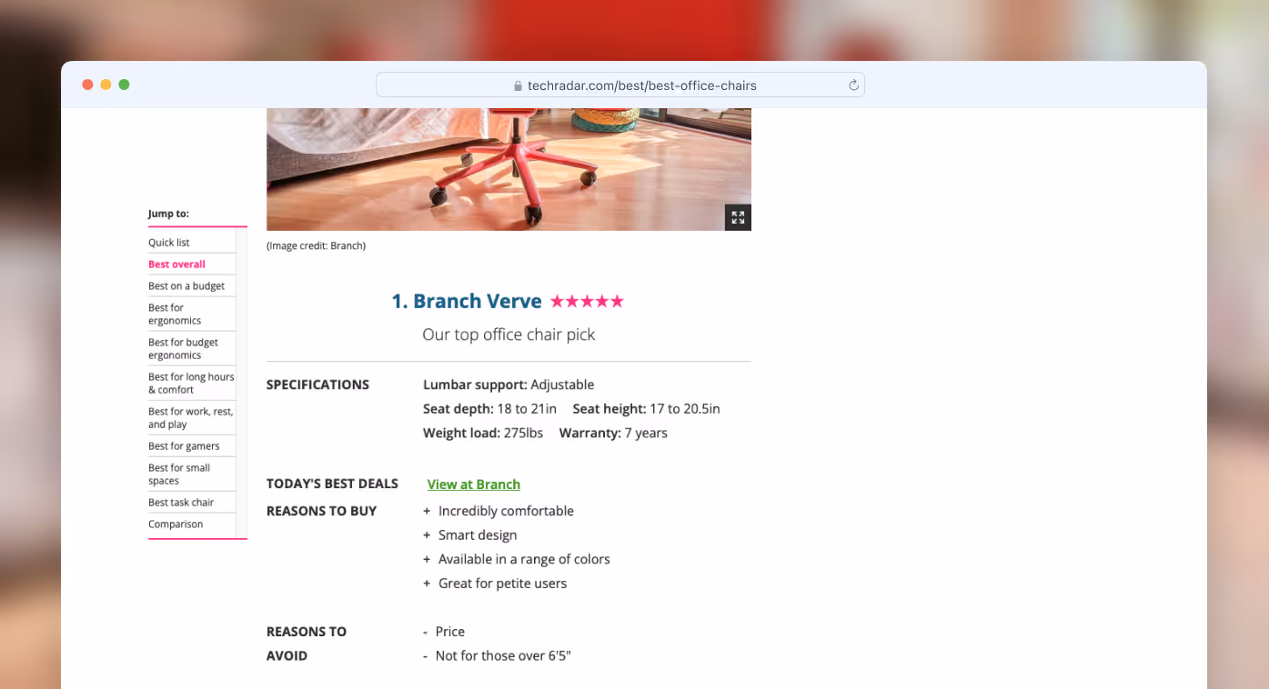
Say someone’s researching the best home office chair for remote work. Walk them through useful comparisons, like lumbar support, armrest adjustments, and seat padding. If your chair checks all the right boxes, position it as one of the top options - and the best fit, supported by clear benefits.
When the reader feels informed, not sold to, they’re far more likely to engage with your offer. Here’s an example of how you could organize a simple overview of a product. Notice how the content is easy to scan, and it provides a list of pros and cons, making it even easier for the user to understand whether this is what they’re looking for or not.
Add Product Mentions Where They Make Sense
Every product you mention should align directly with the topic of your content. If your blog post is about selecting the best indoor plants for beginners, linking to Bluetooth headphones will feel disjointed, even if your store sells both. The product should feel like a natural part of the solution the reader is already searching for.
Position your product mentions where they genuinely add value. Visual support like thumbnails, small grids, or a quick customer quote gives the link more credibility and context. In fact, the American Marketing Association states that incorporating user-generated content (UGC) like customer quotes can increase web conversions by 29% and is trusted more by consumers than brand-created content.
Let’s see how the widely known athletic apparel retailer Gymshark has approached it. Their blog post about the types of t-shirts starts by explaining the characteristics of each type of t-shirt, and only then leads into product recommendations with a quote, which builds trust. What’s more, the product recommendations are accompanied by visuals, enticing the user to click on them more.

Make Banners and CTAs Work for You
Discounts and CTAs can work wonders when they're positioned strategically. Shouting about an offer in every other paragraph makes your blog feel like a desperate sales page. Instead, place a side banner with a first-time buyer code or use subtle, scroll-triggered pop-ups that appear only when the reader is clearly engaged.
HubSpot research has found that personalized CTAs perform 202% better than generic CTAs.
Mention promotions only after you've delivered value and built trust. Your CTA should feel like a natural next step, not an interruption. A clean transition from content to offer can increase engagement while maintaining the reader’s confidence in your brand.
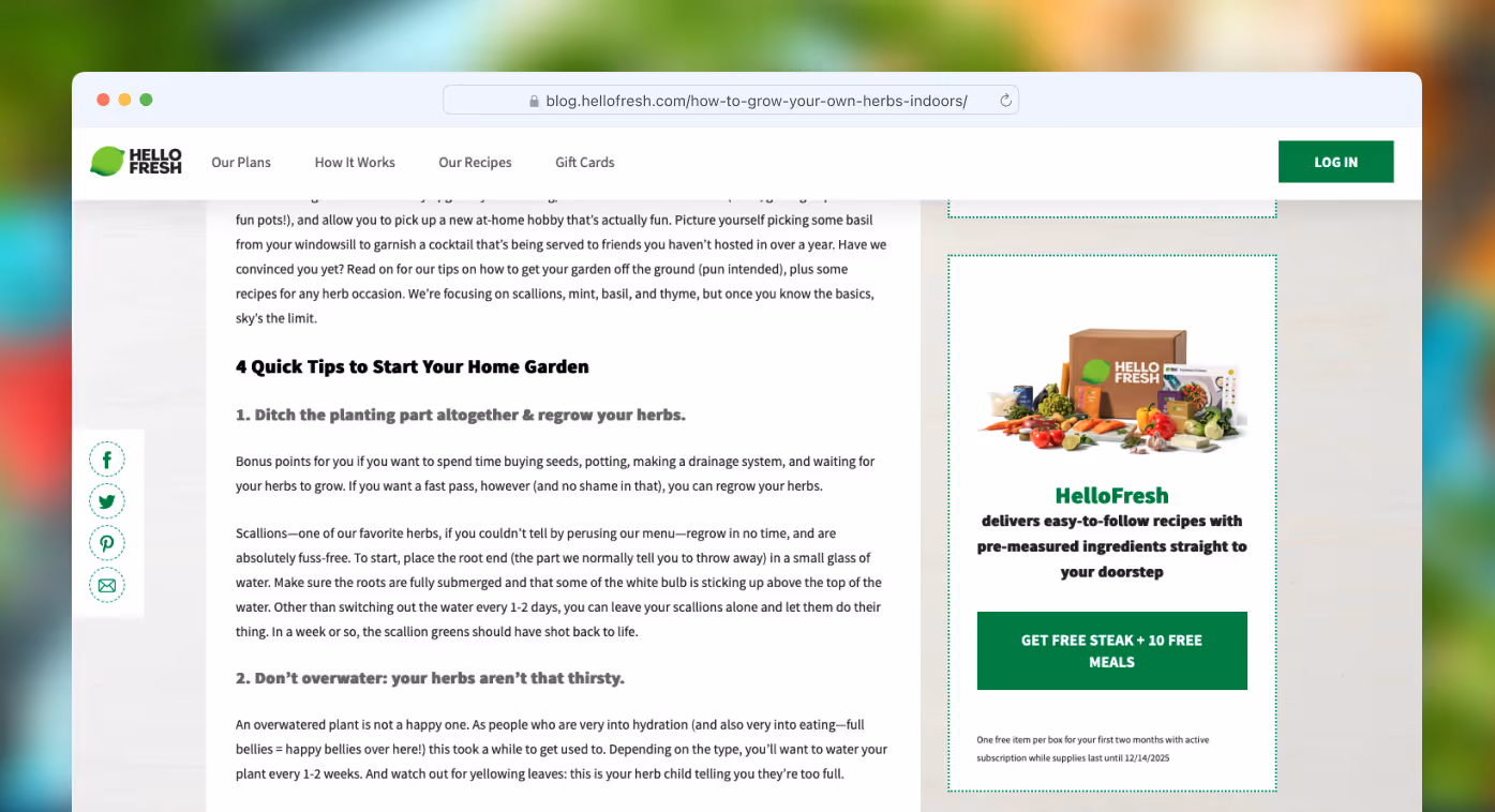
You can see in the example below how HelloFresh has chosen to include a side banner with a free item for the first two months. The design makes the CTA stand out, while keeping the placement subtle.
Make the Blog Feel Like Part of the Store
Don’t design your blog as if it lives on a separate island. When a visitor lands on a post, it should feel familiar, consistent with the menus, visuals, and structure of your main store. Here are some pointers on how to keep your blog visually and structurally integrated with your shop:
- Shared Navigation: Use the same top-level menu and footer so readers can easily switch between content and product pages. Tenet has recently compiled various web design statistics, which show that 94% of users rank website navigation as the most useful feature.
- Design Consistency: Design product callouts in your blog to match those on your actual store (image, name, price, review stars).
- Familiar Sidebars: Include the same promotional blocks or categories found on your product pages to guide users naturally.
- Template Uniformity: Use consistent formatting for all blog posts so they feel like one part of a unified experience.
- Visual Flow: Make sure blog pages follow the same spacing, font, and color logic as the rest of your site, as it’s been said that 38% of people will leave a website if the content or layout isn't attractive.
Here’s what it looks like in practice on the website of Casper, a company that sells mattresses and other sleep products.
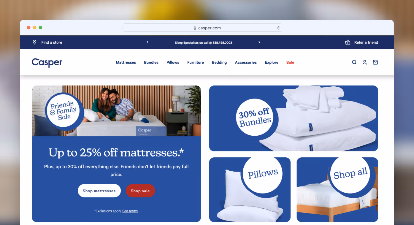
When your blog and store feel like one unified experience, it builds customer trust and strengthens your brand. This way, readers never feel like they're being pushed to shop; instead, it all feels like a natural part of their journey with your website.
Final Thoughts
Selling through a blog isn’t about pushing - it’s about positioning and being strategic. Layout, flow, and visuals all work together to shape how your content is received and whether a reader becomes a customer. When your blog feels helpful, looks clean, and fits naturally within your store, it builds trust without needing to shout.
Consider your own online experience: would you want to feel like you're being sold to the moment you land on a page? For effective conversions, make your blog feel like a genuine conversation, not a sales pitch. Offer the readers useful context and subtly provide a clear next step.
Putting all these pieces together takes time and expertise. If you'd rather focus on running your business while we handle the complexities, our team is here to help. Contact us for expert SEO and marketing services to transform your blog traffic into real eCommerce sales.

Free tips to grow your store
eCommerce related news
New articles every month
Macaroni and cheese recipes
Check your inbox for tips.