For years, e-commerce brands treated the inbox like a digital billboard. Make your e-commerce email design look beautiful in Figma, export it as images, and send it to the list. If it looked polished during approvals, everyone assumed it would perform.
That assumption does not really hold up anymore. People are skimming emails half-distracted on mobile, inboxes are getting crowded with AI-generated summaries, and providers are quietly watching engagement signals to decide which brands deserve visibility over time.
So which email templates actually work better now?
A visually polished, image-heavy campaign that feels premium, a structured HTML email that performs better technically, or a hybrid responsive email template that balances it all?
To answer it properly, we need to look at how these email design templates actually behave inside modern inbox environments, where each approach still works well, and where they start creating problems.
Image-only emails
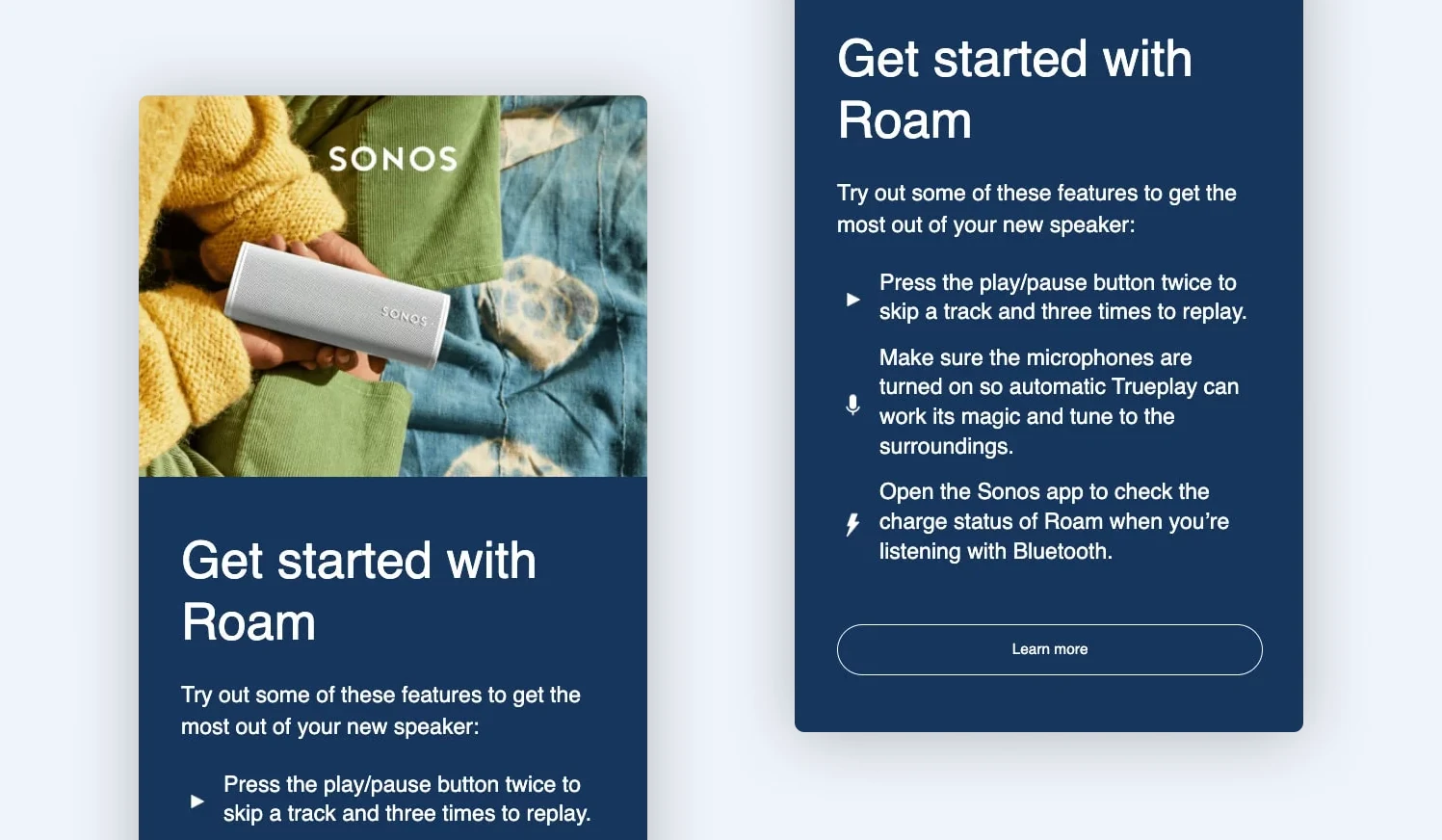
Image-only Sonos email campaign with the headline, body copy, and CTA button embedded inside a single flattened graphic
Image-only emails are campaigns where most of the communication is delivered through graphics rather than coded content. Headlines, CTA buttons, pricing, promotional copy, and banners are all embedded directly into visual assets designed in tools like Figma, Canva, or Photoshop.
This format is still heavily used in industries where presentation strongly influences purchasing behavior. Fashion, beauty, luxury, and lifestyle brands continue relying on image-heavy campaigns because the email itself acts as part of the brand experience.
We’ve seen brands regularly use image-heavy campaigns for:
- Collection launches
- Seasonal campaigns
- Limited-edition drops
- Visually led promotional pushes
Why image-only emails still work
- They protect brand presentation
For luxury and design-led brands, small visual inconsistencies can weaken perceived quality. Image-heavy campaigns allow creative teams to maintain tighter control over how the brand appears inside the inbox.
- They simplify production workflows
Design-led campaigns often move through approvals faster because stakeholders review a fixed visual output rather than coded layouts that may render differently across platforms.
- They reduce layout instability
Email rendering behavior remains inconsistent between Gmail, Outlook, Apple Mail, and mobile apps. So, many teams still prefer flattening campaigns into visuals to avoid spacing, alignment, and font-rendering issues.
- They work well for high-impact promotional campaigns
Single-focus campaigns built around urgency and visual storytelling can still perform effectively with image-heavy structures, especially during product launches and seasonal promotions.
- They lower the technical dependency
Not every business has dedicated email developers or modular email systems. For smaller marketing teams, image-based workflows can feel easier to manage operationally.
Where image-only emails break down
Image-only campaigns still work for certain types of promotional storytelling, but we’re seeing their limitations become harder to ignore in modern inbox environments.
- Image blocking kills visibility
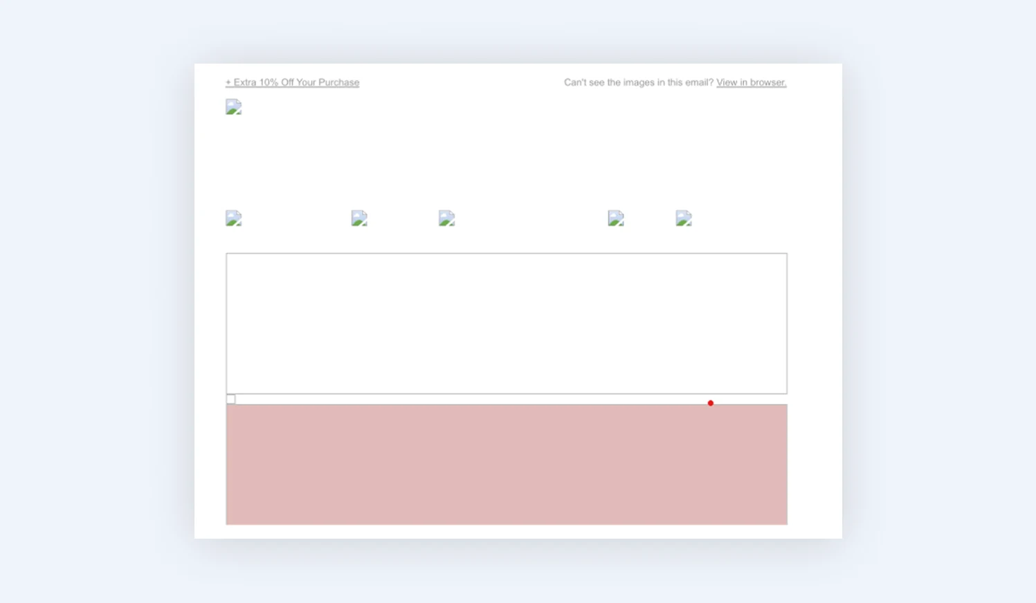
Promotional email with image loading turned off, showing broken image placeholders and empty white space instead of the offer
Look at the image above. If a user has image loading turned off, or their inbox delays loading visuals, this is all they see instead of the actual campaign.
So if your entire campaign lives inside visuals, customers may only see blank spaces instead of the actual offer. That hurts visibility, CTA clicks, and engagement.
Image-heavy emails can also affect deliverability over time. Since they contain very little live text, inbox providers have less context to understand the campaign properly. If users ignore the email or if it loads poorly, inbox placement can gradually decline, too.
You cannot convert customers who cannot properly see the offer. That is one reason many brands are moving toward more balanced hybrid email structures.
- Dark mode creates rendering instability
Dark mode is now the default user preference across email apps and devices because it reduces screen brightness and eye strain. The problem is that many email apps also modify how emails appear in dark mode.
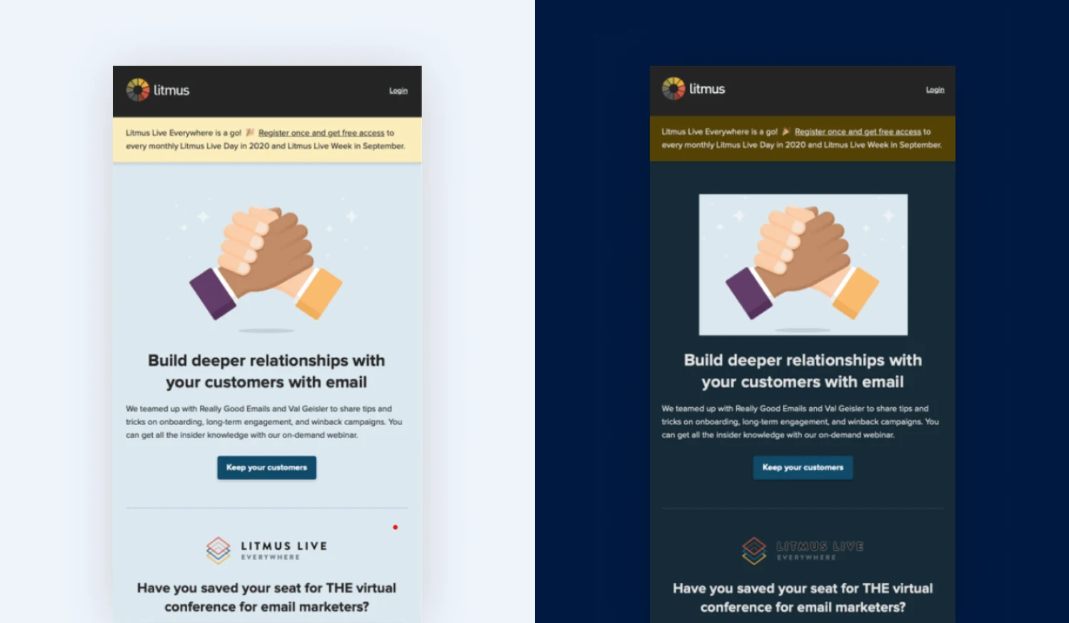
Visual showing color inversion in dark mode
Some automatically darken backgrounds, invert colors, or adjust contrast settings. That creates problems for image-heavy emails because the images themselves cannot adapt after the email is delivered. For example:
- A dark logo designed for a white background may disappear in dark mode
- Black text baked into an image can become difficult to read
- CTA sections may lose contrast against darker backgrounds
We’ve seen that various inbox providers still handle dark mode differently from each other, which makes image-heavy campaigns much harder to render consistently across devices and apps.
- Mobile-first inboxes changed how emails perform
One of the biggest mistakes brands still make is reviewing email campaigns primarily on desktop while most customers open them on mobile devices.
Large promotional graphics may look visually impressive inside design tools, but mobile inboxes expose their weaknesses quickly. Text becomes harder to scan, product sections feel crowded, and CTA buttons embedded inside flattened graphics shrink with the rest of the design.
- Accessibility becomes much harder
Accessibility stopped being just a UX discussion after the European Accessibility Act came into effect in 2025, pushing brands to make digital experiences more usable for people with disabilities.
That creates a real limitation for image-heavy emails because screen readers or voice assistants cannot properly interpret text embedded inside graphics. In practice, that means visually impaired users may struggle to understand your offer, and CTA buttons become harder to navigate.
- Personalization becomes restrictive
One of the biggest reasons image-heavy emails are becoming less practical is personalization.
Modern e-commerce email marketing depends heavily on things like product recommendations, browsing behavior, abandoned cart flows, location-based offers, and real-time inventory messaging to drive conversions.
That creates a problem for image-only campaigns because the content is locked inside static visuals. The moment a brand wants to personalize products, pricing, or promotions, the workflow becomes slower.
Magebit insight: High-yield automated paths like Klaviyo browse abandonment, price-drop triggers, and back-in-stock alerts require an open relationship with your store’s backend.
Storing text and items inside flat imagery severs this connection. If an item sells out on your Magento (Adobe Commerce) or Shopify Plus catalog mid-campaign, an image email keeps advertising a broken link, tanking your conversion rate.
- Heavy image payloads slow performance
Large image-heavy campaigns load slowly on some networks, as shown in the image below. This affects engagement quality as even a 100ms delay in mobile load time can reduce conversion rates.
On mobile, that delay becomes even riskier because users are already scanning quickly and deciding within seconds whether a campaign deserves attention. Image-heavy campaigns also create technical limits many brands overlook:
- Gmail clips emails larger than 102KB
- Many ESPs recommend keeping total image payloads under roughly 2–2.5MB
- Mobile inboxes still struggle with large promotional assets in weaker network conditions
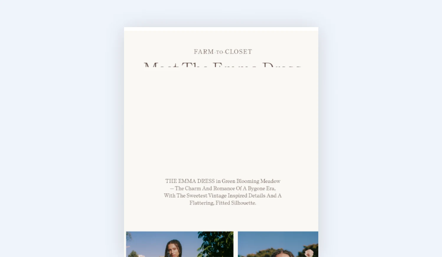
Image-heavy fashion email partially loaded, with the hero graphic still missing while the caption text renders
HTML emails
HTML emails are campaigns built using structured code instead of static image assets. Headlines remain live text, CTA buttons stay interactive, layouts adapt across devices, and content blocks can change dynamically based on customer behavior or segmentation rules.
That flexibility matters more today as modern inbox ecosystems are being shaped by AI-assisted filtering, accessibility standards, and engagement-based prioritization.
HTML emails perform better in these environments because inbox providers can properly interpret the content and structure of the campaign instead of relying only on visuals.
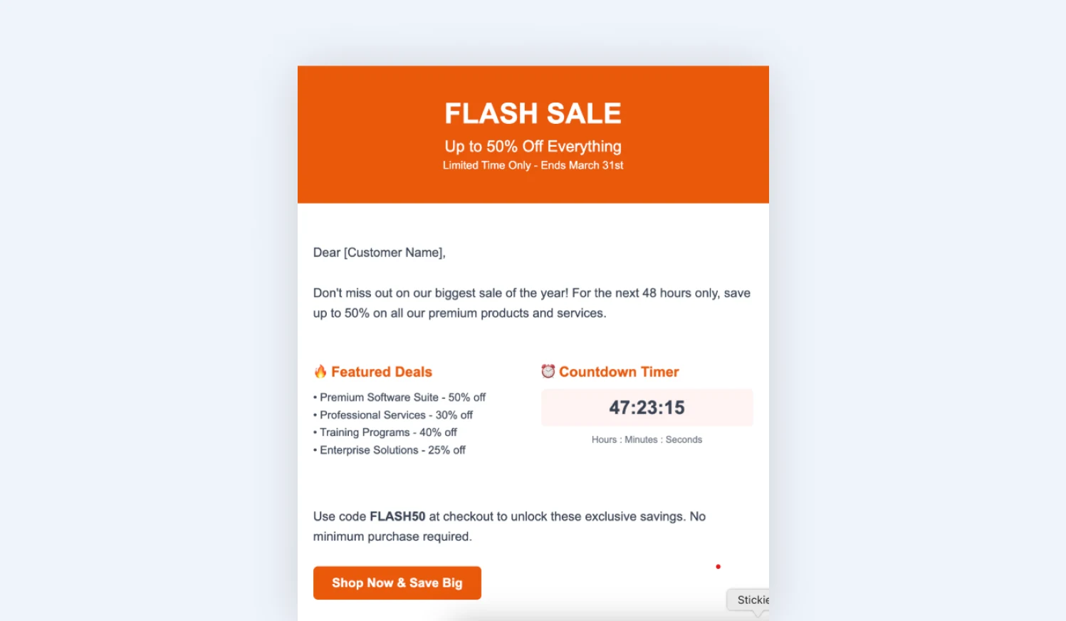
HTML flash sale email built from live text, a coded countdown timer block, and a native call-to-action button
At Magebit, we see brands shifting toward HTML-first systems for:
- Lifecycle automation
- Retention marketing
- Loyalty campaigns
- Personalized customer journeys
Why HTML emails perform better in modern inboxes
HTML emails are no longer just a technical preference. They align much better with how modern inboxes deliver, display, and prioritize email content today.
- They support personalization at scale
HTML emails make it easier to dynamically update products, pricing, offers, and recommendations without rebuilding campaigns for every audience segment.
- They perform better in AI-assisted inboxes
Features like Apple Intelligence and Gemini-powered Gmail summaries rely on live text to interpret email content. HTML emails give inbox providers a more readable context, while image-only campaigns often appear less informative.
- They adapt better across devices and dark mode
Live text, buttons, and layouts adjust more naturally across mobile devices and dark mode environments, helping campaigns stay readable and usable.
- They improve accessibility
Screen readers can properly interpret headings, buttons, and content structure in HTML emails, making campaigns easier to navigate for users with disabilities.
What HTML emails still struggle with
HTML emails solve many modern email challenges, but they introduce operational complexity of their own.
- Email development still feels complicated
One of the biggest challenges with HTML emails is that inbox providers do not display emails the same way. A campaign that looks perfect in Gmail may appear broken in Outlook or render differently inside Apple Mail.
Fonts, spacing, buttons, background colors, and layouts can all behave inconsistently depending on the inbox environment. That forces developers to build HTML emails much more carefully than normal web pages.
Teams still spend significant time testing emails across platforms because rendering consistency remains a major challenge even today.
- HTML systems become harder to manage at scale
One of the less discussed challenges with HTML email systems is how complex they become once personalization and automation scale up.
A modern HTML campaign is often connected to CRM systems, customer segmentation, product feeds, localization rules, automation logic, and analytics platforms. So, even small changes to layouts or dynamic content blocks can affect multiple workflows at once.
Hybrid email template: The right approach for 2026
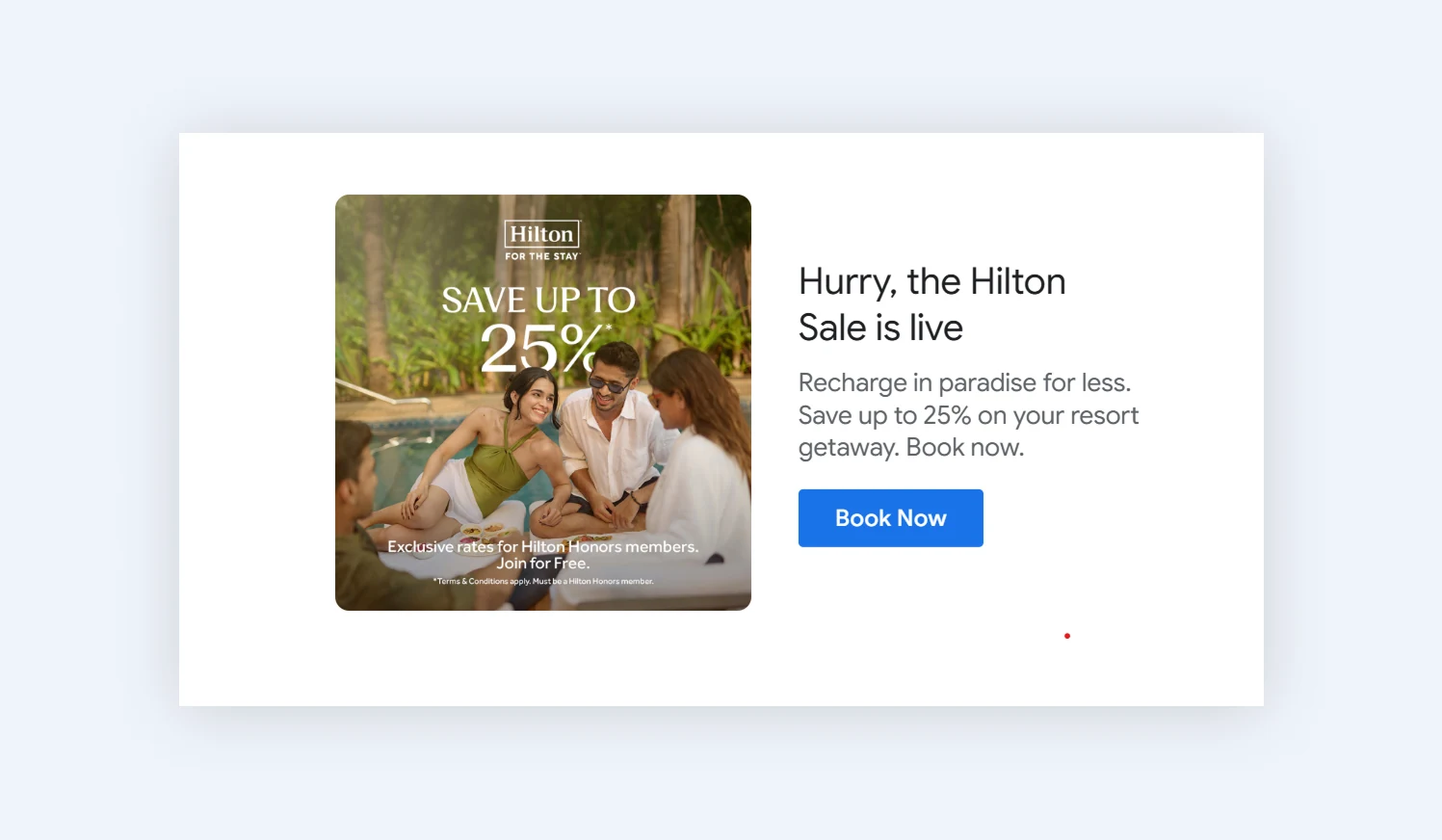
Hybrid Hilton email pairing a branded hero image with a live HTML headline, body copy, and a coded Book Now button
Both image-only and HTML emails still offer clear advantages. Image-heavy campaigns create stronger visual storytelling and tighter brand control, while HTML emails perform better across personalization, accessibility, deliverability, and mobile usability.
That is why we recommend brands move toward a hybrid email design template instead of treating the two formats separately.
How to structure a hybrid framework:
- Isolate creative assets to the hero area
Use high-fidelity imagery for your top-of-email branding and sensory storytelling blocks, where visual control matters most.
- Keep the core value proposition coded
Ensure your specific offers, product titles, pricing data, and copy points remain live, indexable HTML text.
- Deploy native HTML call-to-actions
Never flatten a checkout button into an image. coded buttons load instantly, remain completely readable with images disabled, and maintain proper sizing on mobile touch screens.
- Build an expert modular library:
Instead of hand-coding every campaign from scratch, have developers engineer a robust, pre-tested library of responsive HTML blocks. Your marketing and design teams can easily arrange, swap, and deploy these templates without breaking layouts or introducing operational delays.
So, which email format actually sells more?
There is no universal winner because different campaign structures solve different business problems. The table below describes the strengths and weaknesses of different email formats.
| Email Type | Main Strength | Main Weakness | Best Use Case |
|---|---|---|---|
| Image-only | Strong visual control | Weak accessibility and AI readability | Luxury campaigns, visual launches |
| HTML-heavy | Better personalization and deliverability | More development complexity | Lifecycle marketing, e-commerce retention |
| Hybrid HTML | Best balance overall | Requires more strategic execution | Most modern brands today |
A luxury launch campaign optimized for emotional storytelling behaves very differently from a lifecycle retention email designed to drive repeat purchases through personalized recommendations.
The real performance difference comes from how reliably the email continues functioning across modern inbox environments.
For most businesses, hybrid structures now outperform both extremes. Not because inbox providers “hate images,” but because modern email performance depends on much more than visuals alone.
Final thoughts
The image-only vs HTML debate is no longer really about design preference. It is about how well your emails perform inside modern inbox environments.
The strongest brands today are combining visual storytelling with structured, adaptable email systems that support personalization, accessibility, mobile usability, and long-term scalability.
If your email strategy still relies heavily on static promotional layouts, it may be time to rethink whether your campaigns are truly performing well against modern inbox behavior. Speak to our Magebit expert for more guidance.