
Today, 77% of consumers actively want to use a configurator before buying. In automotive, that makes it one of the most important decision points in the journey. But how are people actually using automotive configurators today?
Are they starting from scratch, or arriving after comparing models, checking reviews, and narrowing down options in an AI chat?
Most automotive configurators don’t reflect this. They still follow a linear, step-by-step flow built around trims, engines, and packages. It’s a structure that has been around for years. But in 2026, people don’t make car-buying decisions in a straight line. They jump between options, revisit choices, and try to understand what actually changes with each step.
If automotive configurators are going to keep up, they need to be more user-friendly in how they support comparison, backtracking, and decision-making. This blog breaks down what that looks like in practice.
Where most automotive configurators fall short
Most configurators are structured around how the product is assembled. From a business perspective, that makes sense. It reflects manufacturing logic, pricing models, and inventory constraints.
From a user’s perspective, it creates extra work. Buyers don’t naturally think in trims or package hierarchies. They think in outcomes: how the car fits their needs, what feels worth the price, and what they can skip without regret.
That mismatch shows up early. A user is asked to pick a trim before they fully understand how it compares to other options. They move forward with partial context and keep filling in the gaps as they go.
Across the flow, the same pattern repeats:
- Differences between options take effort to understand
- Feature dependencies appear after selections are made
- Price updates without clearly showing what changed
In practice, users end up doing their own comparison work inside the configurator. That’s where friction builds.
What’s changed in 2026?
8 tips to design more user-friendly product configurators for automotive merchants
Before getting into specific improvements, it helps to look at where most configurators start to feel difficult to use. Most configurators are built around how products are structured. What users need is something built around how decisions are made.
These are the details that shape whether a configurator feels smooth to move through or harder than it should be. The sections below break down what to focus on.
1. Make comparison effortless, especially on mobile
In many configurators, comparing options still means going back and forth. Open one trim, check details, go back, open another, and try to remember what changed.
This becomes even more frustrating on mobile, where screen space is limited and switching between views takes more effort. What feels manageable on a desktop quickly turns into friction.
You can see a more current approach in the Polestar configurator. As users switch between configurations, key variables update instantly in the same view.
There’s no need to navigate across pages or dig into separate spec screens. The comparison happens as part of the interaction. That matters because many users don’t arrive at configurators from scratch. They often come in with a:
- Recommended variant
- Shortlist from comparison platforms
- Rough sense of budget and priorities
At that point, they’re not exploring broadly. They’re trying to understand what actually changes between a few options. In most configurators, that answer is buried in specs. Users have to read, compare, and keep track mentally.
Stronger ones bring that forward. Price, performance, and key features update in place, so users can see the impact of each change immediately.
That’s one of the first gaps we look for at Magebit. When the impact of a choice isn’t clear, users slow down, especially on mobile, where every extra step adds friction.
2. Move from showing the car to simulating ownership
Most automotive configurators today already use 3D. Users can rotate the vehicle, zoom in, and explore details from different angles. That’s the baseline.
What’s changing in 2026 is what the visual layer is expected to do. It’s no longer just about rendering the car accurately. It’s about helping users understand what it would feel like to own it.
You can see this shift in how Volvo is evolving its configurator experience. Instead of limiting visuals to a studio model, the experience extends into a real-world context on a road. These aren’t fully standardized yet, but they point to a clear shift.
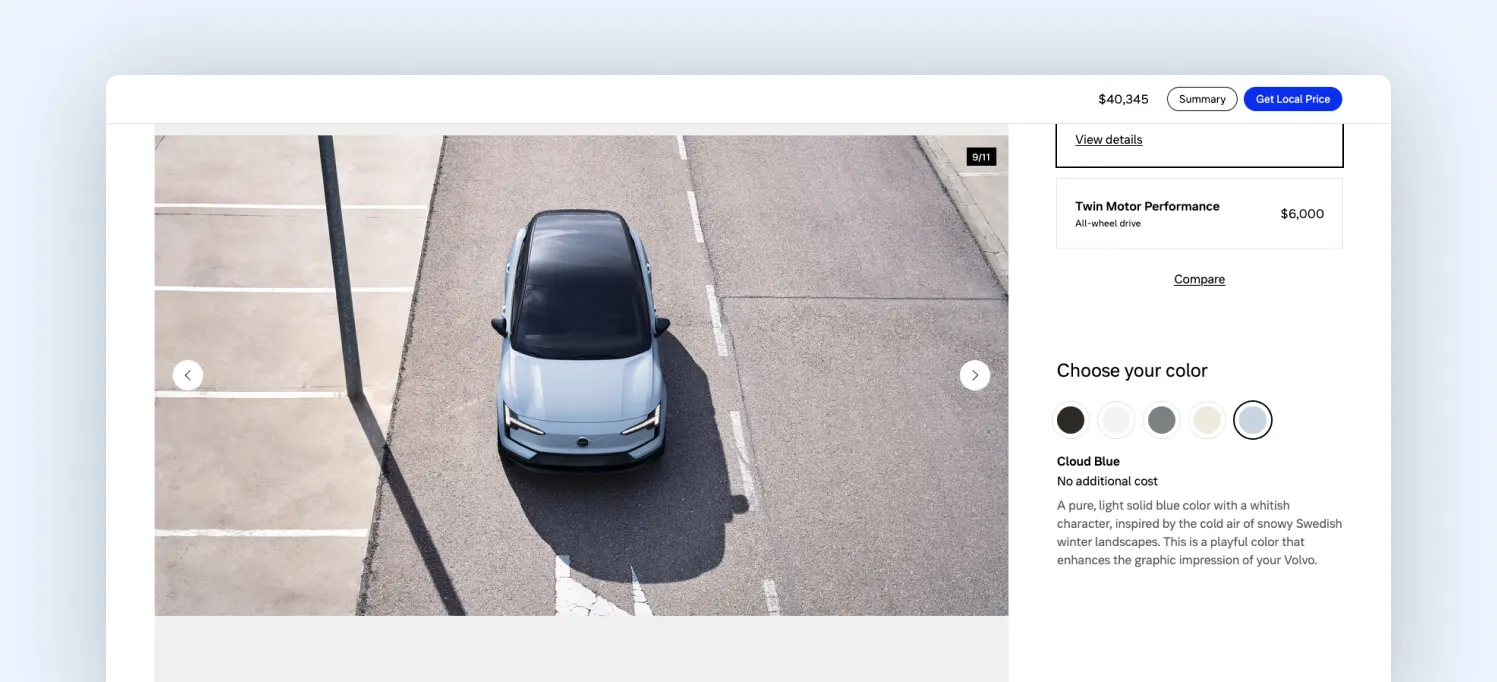
In earlier configurators, visuals answered one question: what does it look like? In 2026, they need to answer a different one: what will this feel like in my life?
To get there, the visual layer needs to move beyond low-fidelity or 2D mockups and lean into high-quality, photorealistic 3D. Lighting, materials, and reflections should behave the way they do in the real world.
It also helps to start with configurations that look premium by default. The first impression sets the tone. Surrounding elements matter just as much. Backgrounds and environments should complement the car and reflect how it would actually be used.
In our recent audits, this is where we see the gap widening. Many configurators still stop at product visualization, while user expectations are moving toward experience simulation.
3. Make configurators more accessible
In traditional configurators, accessibility is handled at the surface across labels, contrast, and basic navigation. But configurators aren’t static. Every selection changes something: price updates, options shift, and dependencies come into play. These are dynamic changes, and they’re not always communicated clearly.
You can see a structured starting point in the Ford configurator. The layout is organized, options are grouped, and selections are clearly visible. But once the configuration starts updating, users still have to interpret what changed.
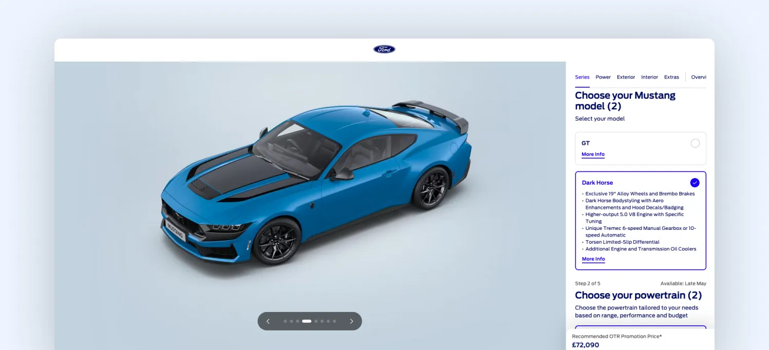
That’s the gap. In 2026, accessibility comes down to making every change perceivable, not just visible. If a selection affects something else, the configurator needs to communicate it in real time: what changed, why it changed, and what the user should do next.
At Magebit, this is one of the first things we look for. If users have to discover changes on their own, the experience is already adding friction.
4. Make system latency invisible to the user
Configurators in 2026 are doing more behind the scenes. Pricing pulls from multiple systems, availability changes in real time, and AI layers may be suggesting or validating configurations as users go. That adds latency.
The issue isn’t that systems take time. It’s that users can feel it. In many configurators, a user selects an option and waits. Price updates after a moment. Availability adjusts slightly later. The interface catches up in steps.
That creates uncertainty. Users pause, click again, or recheck what they selected. You can see a more stable approach in the BYD configurator.
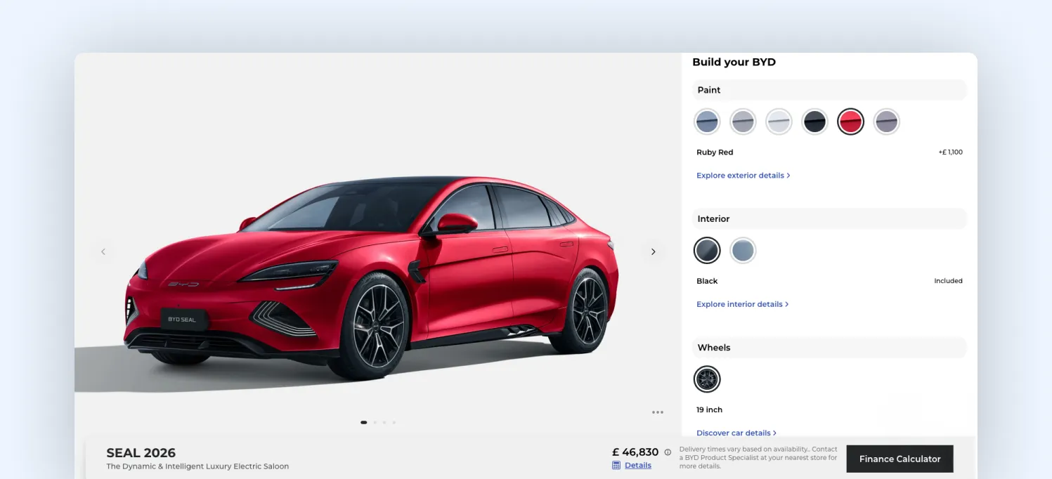
When a selection is made, the interface responds immediately, before every backend update is complete. The selected state is confirmed right away, and changes appear progressively instead of all at once.
So even if multiple systems are involved, the interaction feels continuous. That’s what’s changed. In 2026, configurators aren’t just front-end tools. They sit on top of real-time systems, and delays are unavoidable.
At Magebit, this is something we account for early. The question isn’t whether the system is fast; it’s whether the experience feels uninterrupted while the system catches up.
5. Make configurations portable, not just saved
Most configurators let users save a build. But that’s still contained inside the tool. In 2026, configurations are starting to move across contexts. A user might:
- Paste a build link into ChatGPT and ask, “Is this worth it?”
- Share it with a dealer and expect them to see the exact setup
- Compare it against another model on a third-party platform
That only works if the configuration is structured and transferable, not just stored. In many configurators we review, this is where the journey breaks. Users save builds, but when they return or share them, key context is missing, and they end up rebuilding or rechecking everything.
You can see a clear example in the Range Rover configurator. Users can save and share their build through a unique link.
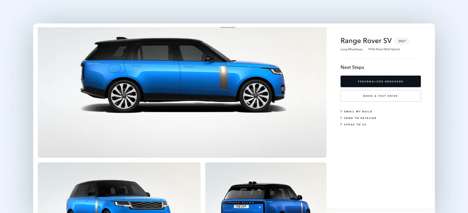
The full configuration (model, options, and pricing) can be reopened or shared with a dealer without needing to recreate it.
6. Let your configurator remove irrelevant options as users decide
Most configurators keep every option visible throughout the journey. Even after users make clear choices, the interface continues to present the full range of possibilities. That keeps cognitive load flat from start to finish.
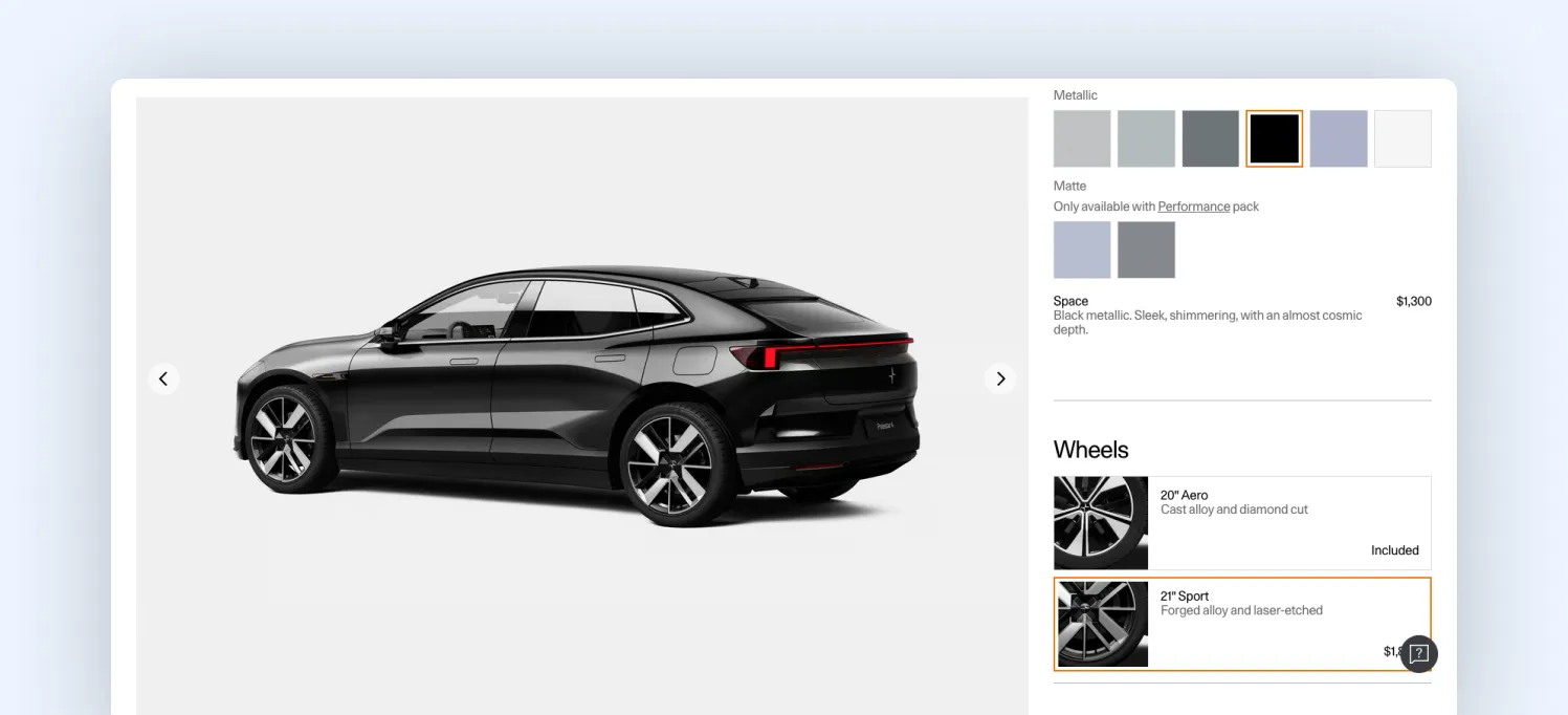
In Audi’s configurator, you can see a more structured version of reduction. As users move from trim selection to packages and finishes, the set of available decisions becomes narrower. In the example below, once a trim like Technology 40 TFSI is selected, the next step doesn’t show all possible configurations. Instead, it surfaces specific package options tied to that trim.
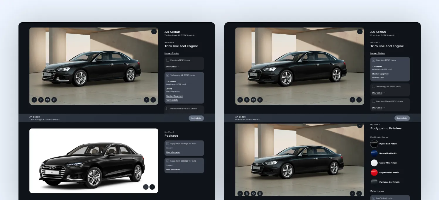
This isn’t dynamic or intent-based filtering. The system isn’t learning from the user. But it does something important: It structures the journey so that each step inherits constraints from the previous one, reducing what the user needs to evaluate next.
That’s the shift. The configurator doesn’t need to remove options aggressively. It needs to stop reintroducing decisions that have already been implicitly resolved.
In weaker experiences, users keep revisiting the same mental comparisons at every step. In stronger ones, like this, the decision space narrows progressively through the flow itself.
7. Make your configurator work with agentic commerce systems
Most configurators are built only for human interaction. Everything is structured for clicks, screens, and step-by-step flows. In 2026, that’s no longer enough.
Users are increasingly relying on AI to guide decisions. They ask tools what to buy, comparing options, and even validating configurations before they commit. This is where agentic commerce comes in: AI systems acting on behalf of users to research, compare, and recommend.
Platforms like Edmunds structure vehicle data in a way that is already close to machine-readable.
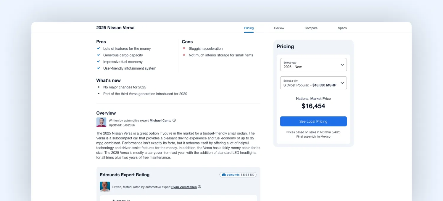
Look at the image above. Information is standardized, comparable, and separated from the interface layer, making it easier for AI systems to extract and reason over it. In 2026, it’s not just about how your configurator looks. It’s about whether its data can be interpreted outside the interface, through APIs, structured schemas, and consistent product logic.
At Magebit, this is becoming our core consideration. Not just building the experience, but structuring the data behind it so it can participate in AI-driven decision journeys. Because if AI can’t read your configurator, it can’t recommend it.
8. Make backtracking effortless, not disruptive
In most configurators, moving forward is easy. Going back isn’t. A user changes something early, like the trim, and the entire configuration resets or behaves unpredictably. Features get removed, selections change, and the user has to rebuild parts of the setup.
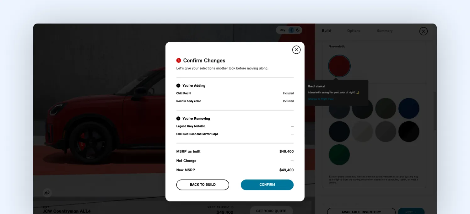
That’s where frustration builds. When we review configurators, we test one thing: How easy is it to reverse a decision? If a user changes an early choice and has to rebuild multiple steps, the experience isn’t stable enough.
You can see a smoother approach in the Mini configurator. When users go back and adjust earlier decisions, the system preserves as much of the configuration as possible. Changes are handled gracefully, and any conflicts are clearly shown instead of silently resetting choices.
The experience stays stable. That matters more now because users don’t configure in a straight line. They explore, adjust, and rethink as they go.
But that doesn’t mean every action should be equally easy to trigger. A full reset or “start from scratch” is a big decision. It shouldn’t sit there waiting to be clicked by mistake. Losing your entire setup in one tap is the fastest way to break trust.
At the same time, backtracking doesn’t need to shout for attention. It should be easy to find when you need it, and invisible when you don’t. Most users just want to keep moving forward. The best configurators respect that, while quietly supporting the moments when they don’t.
Final thoughts
Automotive configurators haven’t really kept pace with how people use them today.
People compare, switch between options, go back, and try to understand what actually changes. Traditional configurators still expect a more linear path, which is where things start to feel heavier than they need to.
A lot of what we covered comes down to small details: how differences are shown, how choices carry forward, how easy it is to adjust something without undoing everything else. Individually, they’re easy to miss. Together, they shape the whole experience.
That’s the layer we focus on at Magebit. Not just how the configurator looks, but how it works as someone moves through it. If you're looking to improve your current configurator or build one from scratch, talk to us. We’ll help you identify what’s slowing users down and how to fix it.

Free tips to grow your store
eCommerce related news
New articles every month
Macaroni and cheese recipes
Check your inbox for tips.