

Suppose you’re on a product page trying to buy a sofa. You start configuring it (choosing the fabric, colour, and size). At first, it feels engaging, but then it starts to feel long. You pause, reconsider a few choices, go back and forth, and eventually leave. Now here’s the problem: that drop-off may not even get tracked.
Ecommerce reporting is still centered around cart and checkout behavior. Even though the average cart abandonment rate already sits at ~70% globally, it only reflects users who made it that far. It does not account for users who drop off during the product configuration stage.
So while product builders are designed to improve conversion, poorly designed ones can introduce friction much earlier in the journey, where it often goes unnoticed. This blog explores where that friction comes from and how to fix it.
What “abandonment” actually means in a product builder
In a traditional ecommerce funnel, abandonment is easy to track. Users drop off between defined stages, such as the product page, cart, and checkout. In a product builder, the journey is not linear, so this model breaks down.
Users move back and forth, compare options, and refine their choices before reaching a decision. Progress is not tied to steps, but to how confidently they can move forward. As a result, standard metrics like add-to-cart or conversion rate only capture outcomes, not the decision process that leads to them.
This is why abandonment inside a builder often goes unnoticed. To track it accurately, teams need to move beyond basic funnel metrics and measure decision behavior instead: how users progress between steps, how often they change options, and where they slow down or backtrack.
In a product builder, abandonment is not just where users exit. It is where they stop making progress towards a decision.
How to identify if your product builder is leaking revenue
Start by setting up a granular funnel inside your product builder so you can track how users move through each step of the configuration. In simple terms, you should be able to see:
- What users select (and re-select)
- What they ignore
- Which step are users on
- How long do they spend at each step
- Where they drop off or get stuck
This gives you a complete view of how users are actually making decisions inside the builder and where that process breaks.
Ideally, combine this with session recordings or heatmaps using tools like Hotjar or Microsoft Clarity. That’s where you’ll see the real behavior: hesitation, repeated clicks, and back-and-forth actions that don’t show up in standard analytics.
Once you have that visibility, check for these red flags:
5 reasons customers abandon your product builder
What we see across implementations is consistent: users don’t abandon because they don’t want the product; they abandon because the system fails to help them decide. Here are the five most common reasons why.
1. The builder increases cognitive load instead of reducing it
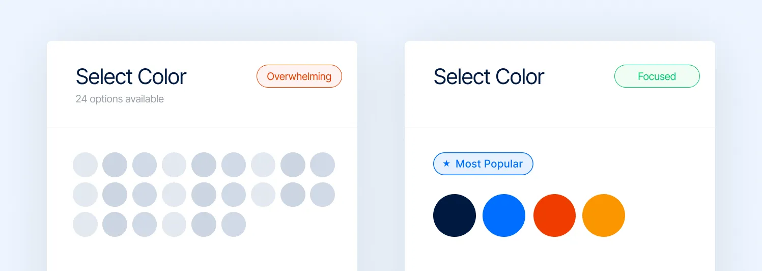
A configurator is, technically, a decision engine. But most are built like option catalogs. So instead of guiding users, they expose the full product space: every variant, every dependency, every possibility.
That shifts the burden of decision-making onto the user:
- Comparing combinations mentally
- Remembering previous selections
- Evaluating trade-offs without support
This is where feature fatigue sets in. Research shows that while users are initially drawn to more options, too many features ultimately make products harder to use and reduce satisfaction. We’ve seen this in real builds:
- Users explore multiple combinations but don’t converge
- Session time increases, but conversion drops
- High interaction ≠ high intent
2. The system doesn’t help users decide
Modern digital experiences no longer just present options; they actively guide decisions. Platforms recommend what to watch, what to buy, and even what to eat. This is the level of personalization users have come to expect in 2026.
In fact, according to McKinsey & Company, 71% of consumers expect personalized interactions, and 76% feel frustrated when they don’t receive them. That expectation also carries into product builders.
However, most configurators still behave like static tools. They present all available options and rely on users to interpret them, compare them, and decide what matters. This creates a clear mismatch.
You’ll see it in behavior:
- Users hovering across options without committing
- Repeated toggling between similar choices
- Exploration without convergence
Builders today can use existing data (popular configurations, historical orders, and selection patterns) to guide users in real time. Some are beginning to layer in AI-assisted recommendations that suggest configurations based on minimal input, or dynamically prioritize options as users interact.
Yet in many implementations, this capability is underused. High-performing configurators close this gap by building guidance into the system itself:
- Starting with a sensible default or best-seller
- Highlighting “recommended” or popular configurations
- Using rule-based or AI-driven logic to narrow choices
- Structuring the flow so users are led, not left to explore
Note: If your configurator has 50 colors but no 'Most Popular' tag, you're not giving users a choice; you're giving them a chore.
3. The builder doesn't clearly show what changed
A product builder only works if users can immediately understand the impact of their choices. When a user selects an option, the system should make the outcome obvious: visually, functionally, and in terms of price.
But if these changes are slow, subtle, or unclear, users are left trying to piece things together. You can see it in how they behave:
- Toggling between options just to spot differences
- Repeating selections to double-check what changed
- Going back to earlier steps because something didn’t register
There’s also a common misconception that more advanced tech solves this. It doesn’t. We’ve seen complex 3D or AR configurators underperform simply because they’re slower or harder to interpret. In contrast, simpler interfaces often convert better when they make changes immediate and obvious.
4. Pricing feels like a moving target
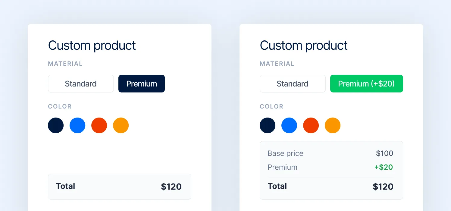
Dynamic pricing is necessary in configurators. But most implementations handle it poorly. If your prices update without a visual explanation, it becomes confusing from a user’s perspective.
This triggers friction immediately. We already know that unexpected costs are one of the top drivers of abandonment (~55%). Now combine that with:
- Multiple steps
- Multiple price changes
- No breakdown or rationale
You’re essentially asking users to trust a system they don’t understand. This is where things get more serious. Recent research shows that dynamic pricing doesn’t just affect conversion; it directly impacts perceived fairness and trust. In fact, 68% of consumers say they feel taken advantage of when pricing feels dynamic or unclear.
That’s not a pricing problem. That’s a trust problem. At Magebit, we found the following works better:
- Incremental price updates (“+ $20 for premium material”)
- Clear breakdowns by selection
- Anchoring against the base price
5. The builder breaks on mobile
A large share of users enter configurators on mobile. But most product builders are still designed like desktop tools. That gap is expensive.
Complex layouts, small tap targets, heavy visuals, and multi-step flows don’t translate well to smaller screens. What feels manageable on desktop becomes frustrating on mobile.
And mobile users have far less tolerance for friction. What we see in practice:
- Users start configuring, but drop off within the first few interactions
- Inputs feel tedious (dropdowns, sliders, multiple taps)
- Visual feedback is harder to interpret on smaller screens
- Load times increase due to heavy assets
At Magebit, product builders treat mobile as a separate experience, not a scaled-down version of desktop, by providing:
- Simplified flows with fewer decisions per screen
- Larger, thumb-friendly interactions
- Reduced visual complexity with faster load times
- Prioritized steps instead of exposing everything upfront
How to fix it: UX patterns that reduce product builder abandonment
Before getting into specific UX patterns, it’s important to step back and look beyond the configurator itself. Most teams design around the configuration journey: step 1, step 2, step 3. But users aren’t trying to complete a flow. They’re trying to complete a purchase.
That distinction changes how the experience should be structured. Some decisions don’t belong inside the builder at all. For example, actions like uploading a logo or setting brand preferences can be handled once and applied across multiple products, instead of being repeated in every configuration.
At the same time, not every option needs equal importance. There’s a clear difference between what users need to complete the purchase and what’s simply nice to have. When everything is treated equally, friction increases.
At Magebit, we approach this by designing for the customer journey first, and fitting the configurator into it, not the other way around. Based on this, here are the UX changes that help cut friction and improve completion:
1. Reduce interaction steps per decision
Most configurator UX discussions focus on what users see. The bigger issue is often how many actions it takes to decide. Every decision in a product builder has an interaction cost:
- How many clicks or taps does it require
- How many states does the user have to move through
- How often do they need to repeat the same action
These costs compound. In a flow with 6–8 decisions, even adding one extra step per decision can double the total interaction effort. Users don’t consciously notice this, but they feel it as friction. This is where many builders underperform.
They are functionally correct, but interaction-heavy:
- Opening controls to access options
- Navigating in and out of selection states
- Repeating actions to compare alternatives
This creates a stop-start experience instead of a continuous one. High-performing configurators reduce this by designing for single-cycle decisions. This means users can evaluate options, compare them, and commit, all within one interaction state.
A good reference is Printful’s product customizer, where selecting a product or variant does not require entering and exiting controls. Options are immediately actionable, and users can move forward without repeating interactions.
The product builder we designed for Selfnamed is another good example, where decision steps are clearly visible and don't require entering and exiting for each selection made. At the same time, it gives users the ability to save their progress, so they can return later or recover from accidental exits without starting over.
2. Keep the configuration summary visible
One of the most common UX gaps in configurators is that users lose track of what they’ve built. Selections are made step by step, but the system doesn’t continuously reinforce them. As a result, users are forced to rely on memory to answer basic questions: What have I selected? Did that change apply? What does my final product look like now?
This creates avoidable cognitive load. From a behavioral standpoint, this is a classic violation of recognition over recall, a core usability principle per the Nielsen Norman Group. Interfaces should minimize the need for users to remember information by making it visible at all times.
Most configurators do the opposite. They distribute decisions across steps but don’t provide a persistent view of the current state. That leads to:
- Rechecking previous steps
- Repeating selections to confirm
- Hesitation before progressing further
A persistent summary solves this by externalizing memory. Instead of holding decisions mentally, users can:
- See all selected options in one place
- Understand how the product has evolved
- Validate choices without navigating backward
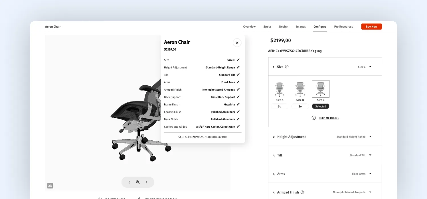
A strong implementation example is Herman Miller’s configurator, where selections are continuously reflected in a visible summary alongside the product. Users don’t need to check what they’ve done; the system keeps it visible.
3. Make changes obvious instantly
In a configurator, every interaction creates a simple expectation: I changed something—show me what happened.
When that feedback is delayed, subtle, or unclear, users lose confidence in the system. This is not about performance alone. It’s about perceived responsiveness.
One of the core usability principles is visibility of system status: the system should always keep users informed about what is happening, through immediate and clear feedback. Most configurators violate this in small but critical ways:
- Visual updates happen, but the change isn’t obvious
- The entire product re-renders, forcing users to scan for differences
- Feedback is delayed just enough to feel disconnected from the action
From a system perspective, everything is working. But from a user perspective, the cause-and-effect relationship is weak. That’s where uncertainty comes in. High-performing configurators reduce this uncertainty by making changes immediate, localized, and explicit:
- Highlighting only the part of the product that changed
- Using subtle motion or transitions to draw attention to the update
- Pairing visual updates with micro-feedback (“Material updated”, “Color applied”)
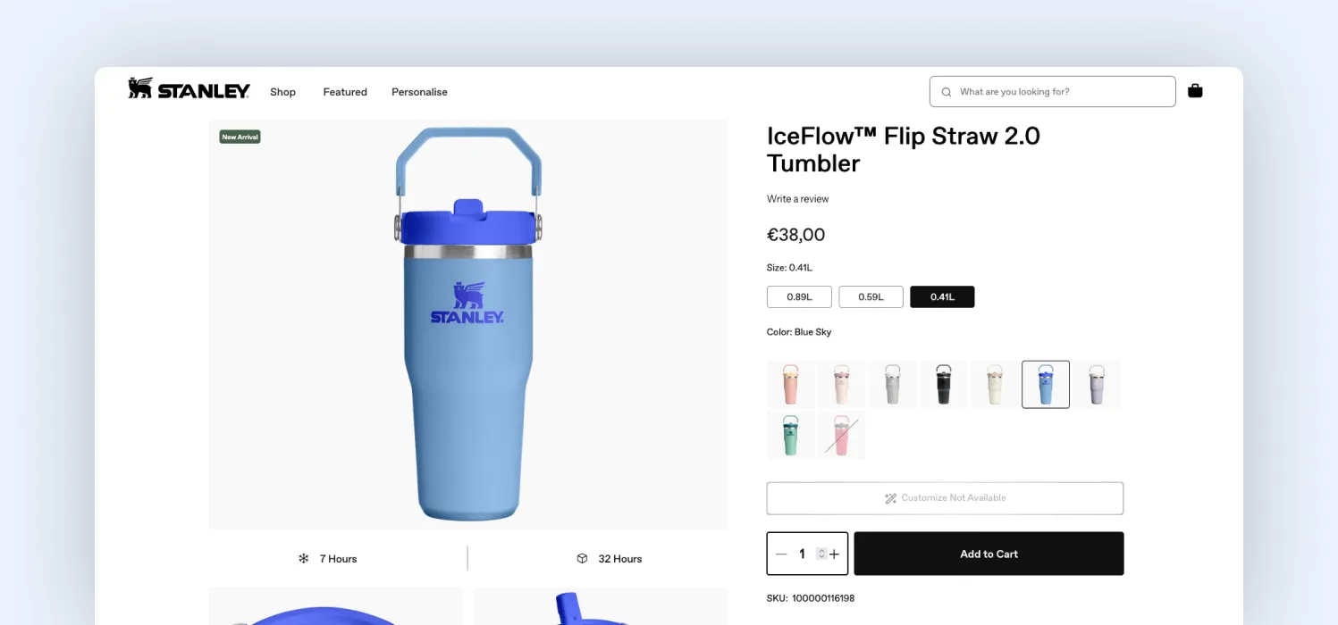
A good reference is Stanley 1913’s customization flow, where changes are reflected instantly and clearly in real time. Also, instead of re-rendering the entire product, updates are localized to the exact area that changed. So, users are not scanning the entire product to spot differences. Their attention is guided directly to the change.
At Magebit, we treat this as a feedback latency issue. The focus is on how fast the system responds, but also on how quickly users can understand that response.
4. Make pricing predictable, not just visible
Pricing issues in configurators are about interaction design, not just numbers. Most builders update the price after a selection is made. That creates a reactive experience: users click first, then try to understand what happened.
From a UX standpoint, this breaks the principle of mental models: users can’t form a consistent understanding of how the system behaves. So every selection becomes a guesswork. That’s where hesitation comes in.
The fix is not just to show pricing clearly. It’s to design pricing so users can predict outcomes before interacting. That requires specific UI changes:
- Expose price impact at the option level
Instead of showing the price only at the total, attach it to the choice itself
(e.g., “Premium material + $20” visible before selection)
- Structure options into price tiers
Group choices as standard / upgraded / premium, so users understand the relative cost without calculating
- Keep a stable base price visible at all times
So every change feels incremental, not arbitrary
- Avoid delayed or batched price updates
Price should update immediately and be visually tied to the action
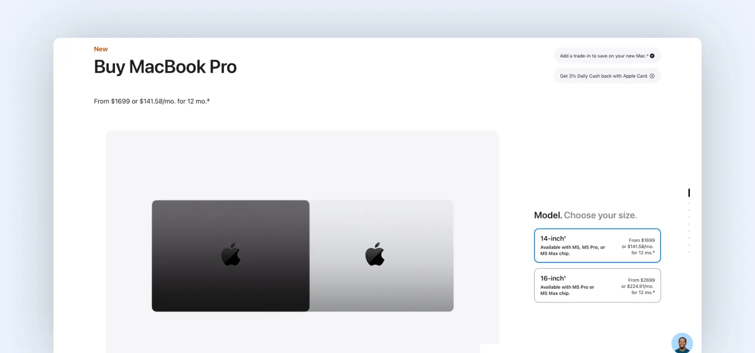
A useful reference is Apple’s configuration flow, where users see the price difference for each upgrade before selecting it. Instead of forcing users to calculate impact after clicking, Apple uses price anchoring, keeping the total price visible while showing incremental changes at the option level.
5. Design for mobile as a primary experience
Mobile is not just a smaller screen. It’s a stress test for your decision architecture. On desktops, users compensate for poor structure by scanning, comparing, and multitasking. On mobile, that breaks immediately. There’s no space to process multiple variables at once.
This is why mobile drop-off in configurators is typically higher; it exposes when the system is asking users to hold too much in working memory. What changes in high-performing implementations is not layout; it’s decision density.
At Magebit, when we redesign builders for mobile, we don’t adapt the UI. We reduce the number of decisions a user needs to process at any moment. That requires specific UI changes:
- Limit each screen to one primary decision: Avoid presenting multiple unrelated choices together
- Convert parallel choices into sequential ones: Break option groups into steps instead of stacking them
- Collapse secondary options until needed: Show advanced settings only after a primary choice is made
- Use large, direct manipulation controls: Replace small inputs (dropdowns, sliders) with tap-friendly elements
A good example of a mobile-responsive builder is Zazzle’s mobile customizer, where editing is broken into tightly scoped actions instead of exposing the full configuration space. The result is better mobile performance and a cleaner decision flow across all devices.
Final thoughts
Users do not abandon product builders because they lack interest. They abandon when the process of configuring becomes harder than the decision itself.
This usually does not come from one obvious issue. It builds up through small UX gaps: too many steps, unclear choices, delayed feedback, or decisions introduced without context. Each one adds a little friction, and together, they break momentum.
That’s where experience matters. At Magebit, we don’t just build product builders; we analyze the entire customer journey around them. From CRO audits and UX optimization to ongoing performance analysis, we identify where users drop off and continuously improve how they move from exploration to purchase.
If your builder shows high interaction but low completion, you’re likely losing revenue inside the configuration flow. Get in touch with Magebit to diagnose, optimize, and scale your product builder performance.

Free tips to grow your store
eCommerce related news
New articles every month
Macaroni and cheese recipes
Check your inbox for tips.