The most underused AOV tool in eCommerce costs almost nothing to build
There is a small UI element sitting in most eCommerce stores, either doing almost nothing or doing a significant amount of heavy lifting, depending almost entirely on how it was set up.
The cart progress bar. The free shipping bar. The reward tracker. Whatever the store calls it, the idea is the same: show the customer how close they are to something they want, and let the psychology of incompleteness do the rest.
Done badly, it is ignored. Done well, it reliably increases average order value by 10-25%, reduces cart abandonment, and in some cases drives repeat-purchase behavior long after the initial order.
This article covers the full picture: why these bars work at a psychological level, how to set your threshold correctly, what rewards to offer beyond free shipping, how free gifts perform versus discounts, where to place the bar in your store, and what the copy needs to say to actually move people.
The data on this is not ambiguous:
- 58% of shoppers say they have added items to a cart specifically to qualify for free shipping
- Cart progress bars increase AOV by 10-20% when implemented correctly
- NuFace saw a 90% increase in orders after introducing a free shipping threshold - from the same traffic
- A dynamic sitewide shipping threshold banner increased one retailer's AOV by 32% across three markets
- Nearly 90% of customers who receive a free gift say they are somewhat likely to purchase more frequently from that retailer afterward
- Free shipping can improve conversion rates by up to 20% versus stores that do not offer it
Most stores have the mechanism. Very few have it set up in a way that actually drives behavior. The difference is almost never the tool - it is the threshold, the reward, the copy, and the placement.
Part 1: Why this works - The psychology behind the bar
Before configuring anything, it is worth understanding why progress bars work. Not at a vague 'customers like free shipping' level, but at a behavioral level - because that understanding changes how you design the whole system.
The goal gradient effect
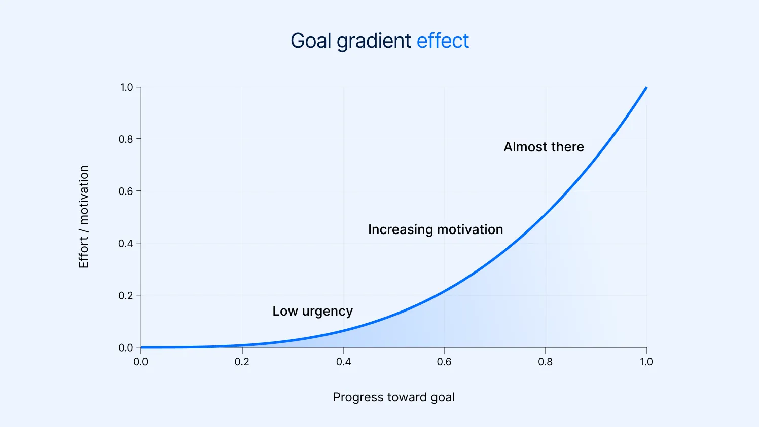
In 1934, behavioral psychologist Clark Hull discovered that rats running a maze accelerated as they got closer to the food reward at the end. The closer they were to the goal, the faster they ran. This is the goal gradient effect: effort accelerates as a goal comes within reach.
It applies to humans shopping online just as directly. When a customer can see that they are $12 away from free shipping, they do not make a rational calculation about whether the extra item is worth it. They feel the pull of the incomplete goal. They are already running. The progress bar does not create that feeling - it makes it visible and measurable, which intensifies it.
The implication for your store: the bar is not informational. It is motivational. Its job is not to tell customers how far they are from the threshold. Its job is to make them feel that they are almost there.
The Zeigarnik effect
Russian psychologist Bluma Zeigarnik discovered in the 1920s that people remember incomplete tasks significantly better than completed ones. The reason is that an unfinished task creates a persistent mental tension - the brain keeps returning to it until it is resolved.
A progress bar that is not yet full is an incomplete task. The Zeigarnik effect means the customer carries it with them mentally as they browse. That tension is why a well-placed cart bar keeps customers in 'shopping mode' rather than shifting to 'checkout mode' prematurely - they are subconsciously working to resolve the incomplete state.
This also explains why tiered bars - where there are multiple rewards to unlock - keep working even after the first threshold is reached. A single-threshold bar creates and then resolves the tension. A tiered bar creates a new incomplete task the moment the previous one is completed.
Loss aversion and the framing of progress
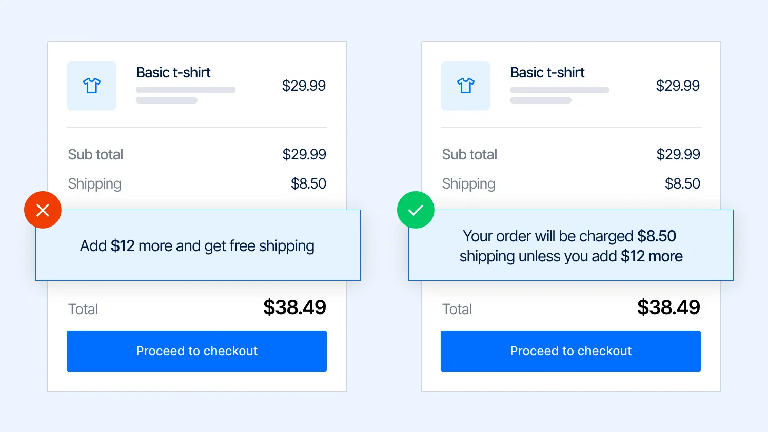
Behavioral economics has consistently demonstrated that people feel losses more acutely than equivalent gains. A $5 loss hurts more than a $5 gain feels good. This applies to how cart bar copy should be written. Compare two messages that convey identical information:
- 'You are $12 away from free shipping'
- 'Add $12 more and get free shipping'
The first frames the gap as something the customer does not yet have. The second frames the action as getting something. Neither is wrong, but testing consistently shows that messages emphasizing what the customer is about to unlock outperform those that emphasize the distance remaining. The customer is approaching a gain, not avoiding a loss.
There is a third framing worth testing, which emphasizes the cost of not acting: 'Your order will be charged $8.50 shipping unless you add $12 more.' This explicitly triggers loss aversion and tends to work well for customers who are close to the threshold but not there yet.
The progress bar is a game
The reason 'gamification' works in eCommerce is not that shopping is secretly a game. It is that the game mechanics - visible progress, achievable goals, unlockable rewards - remove the friction of decision-making by giving the customer a clear, simple objective.
A customer browsing without a bar has to decide: 'Do I want this additional item?' That is a real decision requiring effort.
A customer browsing with a bar showing 'You are $9 away from a free gift' has a mission. The question is not 'do I want this item' but 'which item gets me there.' That is a fundamentally easier mental task, and it consistently produces higher add-to-cart rates on the next product viewed after the bar is noticed.
Part 2: Setting your threshold - The number most stores get wrong
The threshold is the single most important variable in the whole system. Get it wrong and the bar either gives away money for no incremental behavior (threshold too low) or discourages customers who feel it is unreachable (threshold too high).
Start with your AOV, not your shipping cost
Most merchants set their free shipping threshold by calculating their average shipping cost and then finding a cart value that makes it feel affordable. This is backwards.
The threshold is not a cost recovery mechanism. It is a basket growth mechanism. Set it based on what behavior you want to drive, not based on what you need to break even on shipping.
The correct starting point is your current average order value. The threshold should be set above that - high enough to require the customer to add something, low enough to feel achievable. The research and practitioner consensus puts this at 20-30% above current AOV as a starting point, though the ideal number varies by category and price point.
These are starting points for testing, not final answers. The right threshold for your store depends on your product catalog, your customers' willingness to add items, and what items are available to recommend as gap-fillers. If the gap cannot be bridged by something real in your catalog, the threshold is effectively too high, regardless of the number.
The 40-60% rule for threshold reach rate
Once your bar is live, the most important metric to watch is your threshold reach rate: what percentage of orders that see the bar actually hit the threshold.
Industry benchmarks suggest the optimal range is 40-60% of orders reaching the threshold. If your reach rate is:
- Above 80%: The threshold is too low. Most customers were already going to spend that much anyway. You are giving away the reward for free without driving any incremental behavior - this is direct margin leakage
- 60-80%: Slightly low but workable. Consider raising the threshold by 10% and monitoring whether the reach rate drops below 40%
- 40-60%: This is the sweet spot. Enough customers are reaching the threshold to indicate it is achievable, and enough are not, so the incentive is doing real work
- Below 25%: The threshold is too high, or the recommended items are not relevant enough. Either lower the threshold or improve the product suggestions shown in the bar
Important: Reach rate tells you about motivation, not margin. A 55% reach rate with a threshold set too low can still be unprofitable. Check the reach rate alongside the margin per order at the threshold to confirm the model works financially.
Modal order value vs. average order value
One refinement worth understanding: your AOV is the mean of all orders. Your modal order value is the most common order value - the number that appears most frequently in your distribution.
If your AOV is $65 but 40% of your orders are between $45 and $55, the modal order value is closer to $50. Setting your threshold at $78 (20% above AOV) means the majority of your customers are actually $28 away from it, not $13, which is a much harder gap to bridge.
For threshold setting, the modal order value is often a more useful anchor than the AOV. Pull your order distribution from the last 90 days, find where most orders actually cluster, and set your threshold 20-30% above that cluster.
Part 3: Beyond free shipping - Building a tiered reward system
Free shipping is the most common threshold reward because it is universally understood and valued. But it has a structural limitation: once a customer crosses it, the bar stops working. The goal gradient tension is resolved, the Zeigarnik loop is closed, and there is no longer anything pulling the customer to add more.
Tiered rewards solve this. By stacking multiple thresholds with escalating rewards, you keep the motivation alive past the first unlock - and each threshold crossed creates a new incomplete task.
A practical tiered structure
The most effective tiered bars combine reward types that feel qualitatively different from each other, not just quantitatively bigger. A customer who unlocks free shipping and then sees a free gift at the next tier responds differently than one who sees a slightly bigger discount. Each new reward type re-engages the goal gradient from scratch.
The spacing between tiers matters as much as the rewards. Each tier should feel achievable from the previous one - not so close that customers reach it automatically, and not so far that it feels pointless to try. A gap of $20-35 between tiers tends to work for mid-market stores. Higher-AOV stores can space tiers further apart.
The reward at each tier should feel meaningfully different from the one before it. Free shipping at Tier 1, then another discount at Tier 2, then another discount at Tier 3 is a progression that feels like more of the same. Free shipping, then a free product, then a premium experience reward creates three distinct emotional moments.
What to offer at each tier
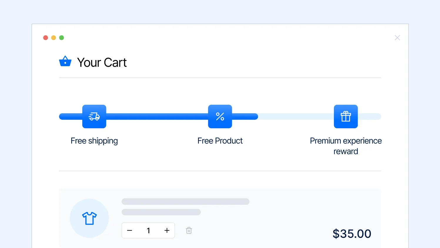
Tier 1: Free shipping
This is the baseline reward and the one with the most direct conversion data behind it. Set it at 20-25% above the modal order value. It should feel like one add-on away for most customers.
One nuance that is often missed: once a customer has unlocked free shipping, update the bar messaging immediately and smoothly. 'Free shipping unlocked!' followed by a transition to the next tier's progress keeps the momentum going. If the bar disappears or stops updating after Tier 1, the motivational work ends there.
Tier 2: Free gift with purchase
The free gift is where many stores see their largest incremental AOV jump, and where the psychology shifts from 'avoiding a cost' to 'gaining something extra.' This distinction matters - it tends to produce stronger emotional responses and better loyalty outcomes than a second discount.
The gift needs to feel relevant and genuinely useful to the customer, not like a way to offload excess inventory. A beauty brand offering a travel-size version of their bestselling serum as a free gift at $75 will outperform the same brand offering a branded tote bag, because one is something the customer was already interested in, and the other is noise.
The gift also does not need to be expensive. A gift that costs the merchant $2-4 but has a perceived retail value of $10-15 typically outperforms a 10% discount on the order value. The customer feels they have received something tangible and real - not just a percentage knocked off a number on a screen.
Tier 3: Premium reward or choice
The highest tier should feel exclusive. Options that work well here:
- A customer-selectable gift - instead of the merchant choosing the gift, the customer picks from two or three options at checkout. This adds a sense of personalization and agency, and consistently produces higher satisfaction than a fixed gift
- Express shipping upgrade included - particularly powerful if your standard free shipping is 5-7 days; offering 2-3 day delivery at the top tier creates a meaningful service upgrade
- A sample kit of new or premium products - this serves dual purposes: it rewards the customer, and it introduces them to higher-value items they might purchase full-size in a future order
- A percentage discount on their next order - slightly weaker as a 'wow' moment at purchase, but strong for repeat purchase rate when the customer receives the discount code in their confirmation email
Part 4: How to choose and use free gifts properly
The free gift is the most underexplored tool in this entire category. Most stores that use them either choose the wrong gift, communicate it badly, or set the threshold too high for it to drive meaningful behavior. Done correctly, it outperforms almost every other threshold reward on both conversion and loyalty metrics.
The data on free gifts
A Harris Interactive study commissioned by IDR Marketing Partners surveyed over 2,500 American adults on their response to free gifts from online retailers:
- Nearly 90% of free gift receivers said they were at least somewhat likely to buy more frequently from that retailer afterward
- 65% said they were at least somewhat likely to share their experience with others online after receiving a free gift
- Two in five Americans said they were very or extremely likely to purchase more often from a site after receiving a free gift
A separate case study from a beauty brand that switched from offering a branded makeup bag as a gift-with-purchase to offering a 7-day skincare sample kit saw:
- Conversion rate increase of 23% from the gift-with-purchase offer
- 41% of customers who received the sample kit purchased full-size versions of the sampled products within 60 days
The second result is the more important one. The gift is not just a conversion tool at the point of purchase - it is a product discovery mechanism that drives future revenue. A sample of something the customer has not tried before is a more powerful loyalty driver than a branded promotional item, because it creates a new reason to come back.
The four rules for choosing the right gift
Rule 1: It must feel relevant to what the customer is already buying
A customer buying skincare products expects a gift that fits that context. A customer buying sports equipment expects something in that space. The worst gifts are branded merchandise (mugs, bags, keychains) that have no connection to the product the customer wanted. They feel like a consolation prize rather than a reward.
The simplest test: would the customer have considered buying this gift themselves? If yes, it is relevant. If not, reconsider.
Rule 2: Perceived value must exceed cost
The gift should feel valuable to the customer, but it does not need to be expensive to achieve this. A 15ml travel size of a product with a retail value of $18 costs the merchant perhaps $2-4 to produce but lands with the customer as an $18 item. That gap between cost and perceived value is what makes gifts more margin-efficient than discounts.
For comparison: a 15% discount on a $70 order costs the merchant $10.50 in margin. A gift with a perceived value of $15 that costs $3 to produce creates a better customer experience at less than a third of the cost.
The margin math of gifts versus discounts consistently favors gifts - but only when the gift's perceived value is genuinely high relative to its cost. A cheap, low-perceived-value gift does more brand damage than a discount, because it signals that the merchant views the customer's loyalty as worth very little.
Rule 3: The quality must match the order value
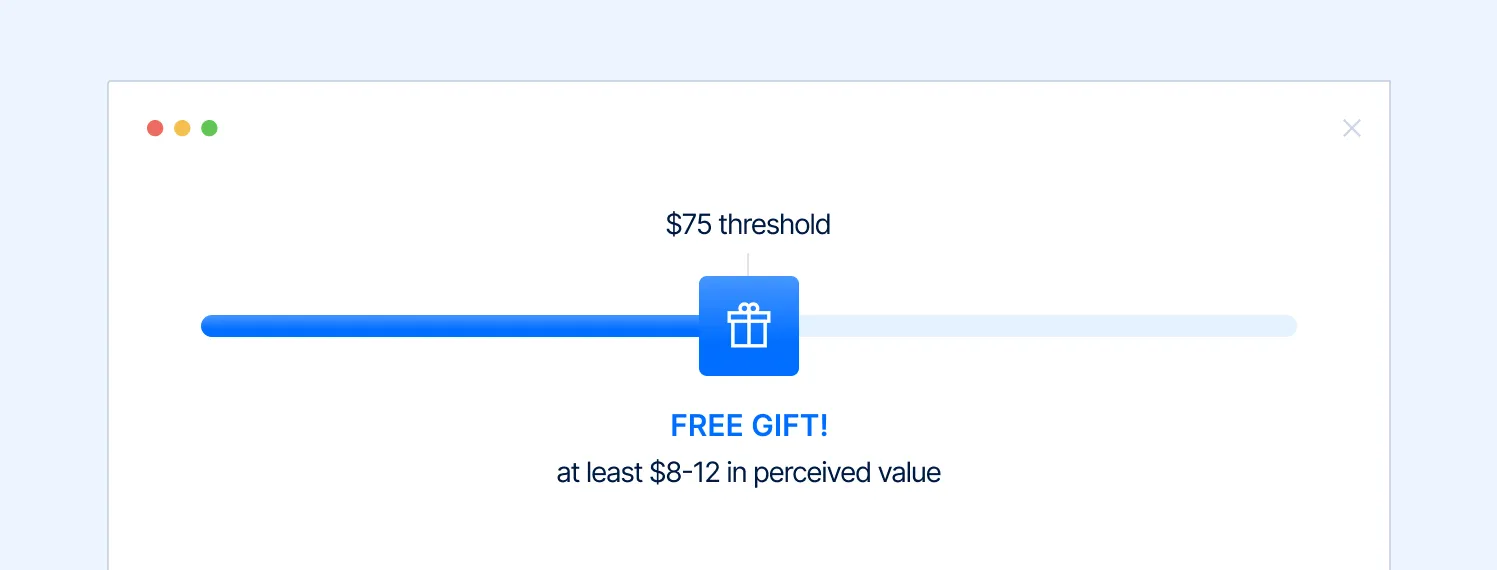
A $5 gift on a $300 order is insulting. The perceived value of the gift should scale with the threshold it is attached to. Higher-value thresholds deserve gifts that feel proportionally substantial.
As a rough guide, the gift's perceived retail value should be at least 10-15% of the threshold it is attached to. A $75 threshold warrants a gift worth at least $8-12 in perceived value. A $150 threshold warrants something that feels like $15-25.
Rule 4: Selectable gifts outperform fixed gifts at higher tiers
When customers choose their own gift from two or three options, satisfaction and perceived value both increase - even if the actual options are identical in cost. The act of choosing creates ownership and investment in the reward.
For lower tiers (Tier 1 or 2 in a three-tier system), a fixed gift is fine and simpler to operate. For the highest tier, offering choice is consistently worth the additional configuration.
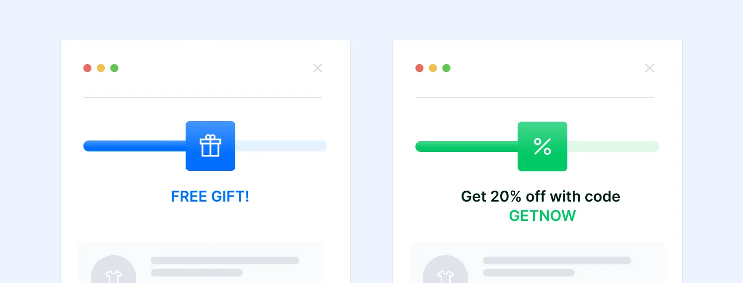
Gifts vs. discounts: When to use each
The ongoing debate between gift-with-purchase and percentage discount as threshold rewards has a clear answer for most contexts - but both have their place.
Discounts solve a purchase decision problem in the moment. Gifts solve a loyalty problem over time. If your primary goal is conversion rate, discounts tend to produce faster, more measurable lifts. If your primary goal is repeat purchase rate and customer lifetime value, gifts consistently produce better long-term outcomes.
Part 5: Where to put it and what to say
A correctly calculated threshold with the right reward, placed badly or written with the wrong copy, will underperform. Placement and messaging are where the difference between a bar that drives behavior and one that gets ignored lives.
Placement: Where the bar should live
The cart drawer is the primary location
The cart drawer - the slide-out panel that appears when a customer adds an item - is the highest-performing placement for a progress bar. The reason is timing: when the drawer appears, the customer has just taken an action (adding something) and is still in active shopping mode. The bar appears at exactly the moment the customer is most receptive to adding more.
A cart page, by contrast, tends to put customers in checkout mode. They have stopped browsing and are preparing to pay. Upselling from the cart page is harder because the psychological shift has already happened.
The announcement bar is the secondary location
A sitewide announcement bar showing the free shipping threshold is always visible and serves a different function to the cart drawer bar: it establishes the offer before the customer even starts shopping. 'Free shipping on orders over $60' seen on arrival sets an expectation that shapes subsequent browsing behavior.
The announcement bar should be persistent, not dismissible. If customers close it, it stops doing its job. Many stores make it dismissible as a UX choice and then wonder why threshold awareness is low.
Product pages: show the gap before it starts
Showing the threshold on product pages - 'Add this to your cart and you will be $14 away from free shipping' - sets the frame before the customer has even started filling their cart. This is a particularly effective placement for stores with lower-priced products where customers typically buy multiple items, because it frames the first purchase as the beginning of a journey rather than a complete transaction.
Do not use modal popups for threshold messaging
Progress bars work because they are ambient - they provide information without interrupting the shopping experience. A pop-up that appears to announce a threshold offer interrupts the flow and tends to generate higher close rates than engagement rates. Keep threshold messaging in persistent, non-interruptive placements.
Copy: The words that make the difference
The copy on a progress bar is rarely given enough attention. Most stores use the default text from whatever app they installed, which is usually something like 'You are $X away from free shipping.' It works, but it is leaving performance on the table.
A few copy principles that consistently improve performance:
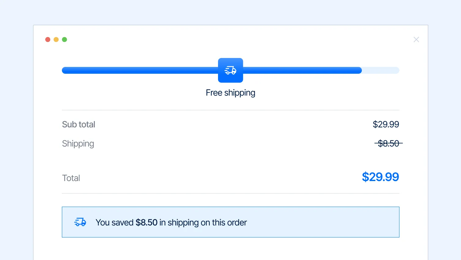
- Always state the dollar amount remaining, not the percentage. '$12 away' is more motivating than '80% of the way there' because it gives the customer an exact, actionable target
- When the threshold is unlocked, quantify what the customer saved. 'You saved $8.50 in shipping on this order' creates a positive anchoring moment that is associated with the purchase
- For gift tiers, always mention the gift's perceived value in the bar copy. 'Free gift (worth $15)' outperforms 'Free gift' because the customer can immediately see whether it is worth the effort of reaching the threshold
- Update the copy dynamically as the cart grows - 'You're $18 away' should become 'You're $5 away' as items are added. Static copy that does not update removes the real-time feedback loop that makes the bar feel alive
Avoid urgent or pressure-based language in progress bar copy ('Hurry!', 'Limited time!'). The bar works through positive motivation - the pull toward a reward - not through anxiety. Pressure-based copy on a bar that is always present feels manipulative, damages trust, and is often counterproductive. Save urgency language for time-limited offers where it is genuinely warranted.
Part 6: The mistakes that make progress bars fail
The gap between stores that see a meaningful AOV lift from their progress bar and stores that see almost nothing is almost never the tool. It is one of the following:
Mistake 1: The threshold is set at or below the current AOV
If most customers are already spending enough to hit the threshold without changing their behavior, the bar is not driving any incremental action - it is just rewarding behavior that would have happened anyway. Every order that qualifies is a cost you absorb with no behavioral return. Check your reach rate. If it is above 75-80%, raise the threshold.
Mistake 2: There are no relevant products to recommend near the threshold gap
The bar creates the motivation to add more. But if there is nothing obvious to add - no low-cost complementary items, no clear accessories, no consumables at the right price point - the motivation has nowhere to go. The bar and your product recommendations need to be designed together. If the threshold gap is $15-20, you need products in that price range that naturally complement what is already in the cart. If those products do not exist, the threshold itself may need to be reconsidered.
Mistake 3: The bar only lives on the cart page
By the time a customer reaches the cart page, they are often already mentally committed to completing the purchase with what they have. Moving the bar to the cart drawer, the product page, and the sitewide announcement bar reaches customers earlier in the shopping journey, when they are more open to adding items.
Mistake 4: The reward is not perceived as valuable
A free gift that customers do not want, a discount percentage that is too small to feel meaningful, or free shipping on a category where shipping was already cheap - these rewards do not motivate. The reward has to feel worth the effort of adding more to the cart. Test different rewards before settling, and listen to what your customers actually respond to.
Mistake 5: Single threshold, not tiered
A bar with one threshold resolves its motivational tension the moment it is reached. A tiered bar with two or three thresholds extends that motivation through the entire cart-building session. If you are only running a single free shipping threshold, adding a second tier with a free gift is typically the highest-ROI change you can make to the whole system.
Mistake 6: The bar disappears or stops updating after the threshold is hit
This is a technical failure that happens in many default implementations. When a customer crosses the first threshold, the bar should immediately transition to showing progress toward the next tier - not disappear. Disappearing bars tell the customer the game is over. Transitioning bars keep the session going.
Part 7: How to measure whether it is working
A progress bar that is live but unmeasured is a guess. These are the metrics that tell you whether the system is working and where to optimize.
Set your baseline metrics before making any changes to the bar setup. A 30-day baseline is the minimum; 60 days is better if order volume allows. Changes made without a baseline cannot be meaningfully attributed.
Testing note: When A/B testing threshold levels or reward types, run each test for at least two full weeks to capture both weekday and weekend purchase behavior. Shipping threshold behavior often differs significantly between weekday browsers and weekend shoppers, and short tests can produce misleading results.
Putting it together
The progress bar is one of the few eCommerce tools that improves three metrics at once when done correctly: average order value goes up, cart abandonment goes down, and - when the reward is a free gift - repeat purchase rate improves over time.
The setup is not complicated. But the details matter enormously. The threshold needs to be set above where customers are already spending. The rewards need to be tiered with qualitatively different incentives at each level. The gift, if you use one, needs to feel relevant and genuinely valuable. The bar needs to live in the cart drawer first, then the announcement bar and product pages. The copy needs to be action-oriented, real-time, and specific about the value being unlocked.
Most stores install a basic free shipping bar, use the default threshold and copy, put it on the cart page only, and then conclude that the bar 'doesn't really make a difference.' It does not make a difference because none of the variables that make it work have been configured correctly.
The tool is not the strategy. The threshold, the reward, the copy, and the placement are the strategy. The bar just makes it visible.

Free tips to grow your store
eCommerce related news
New articles every month
Macaroni and cheese recipes
Check your inbox for tips.